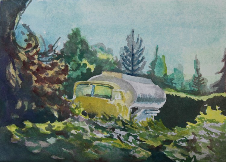
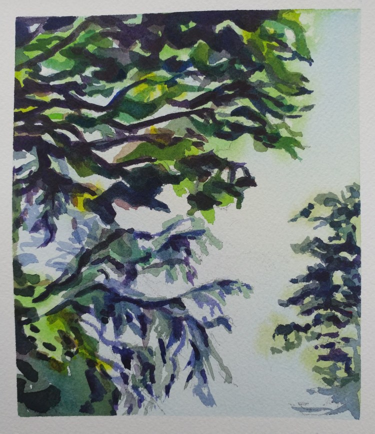
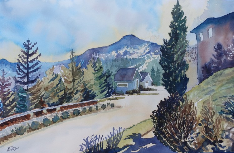
Darkness deepening in the lower mountain while the upper mountain is bright and sunny. It’s that sort of somber feeling at the end of the day.
Last year’s unposted work
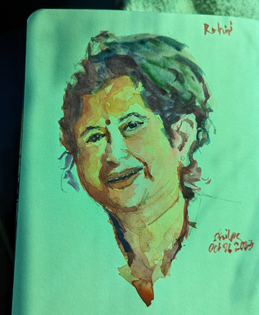
My new year’s resolution is to use fewer shapes in my art. This year, every painting I post will help me evolve into a different personality with my art. I see that happening already! The above work is more recent from October to December 2023. Some of my work does show more simplified shapes while in the others you will see a lot is happening.
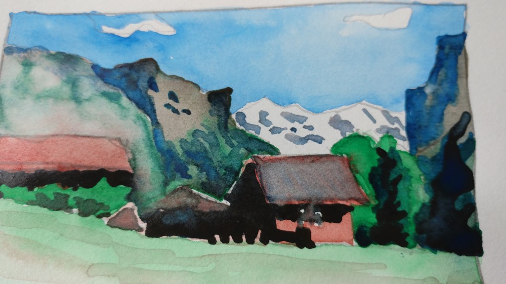
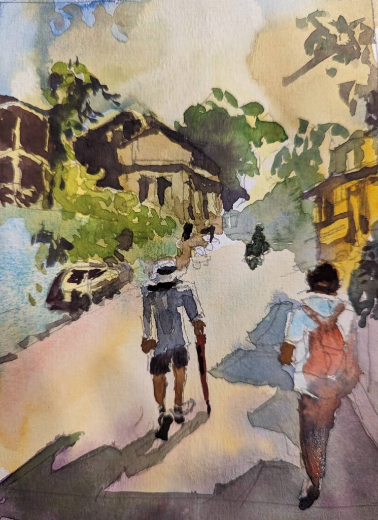
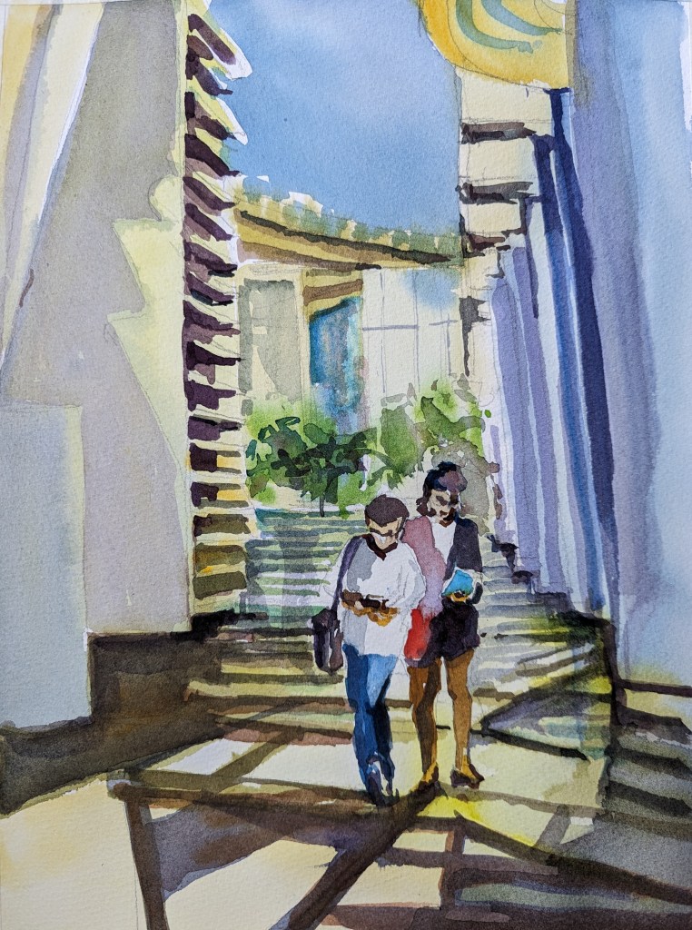
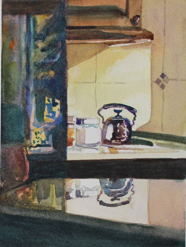
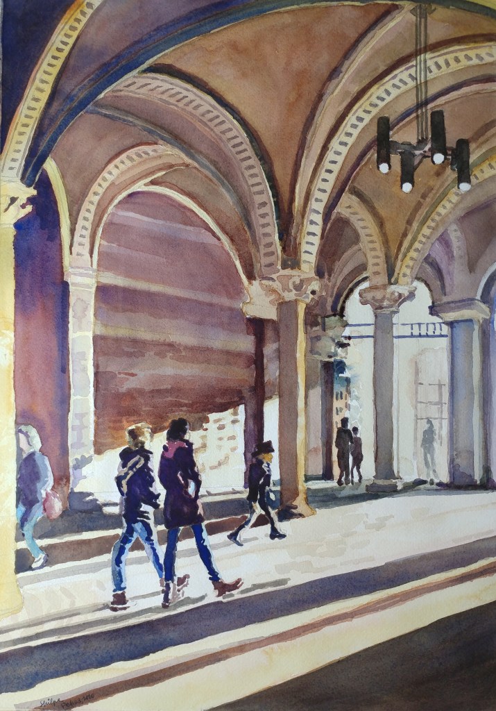
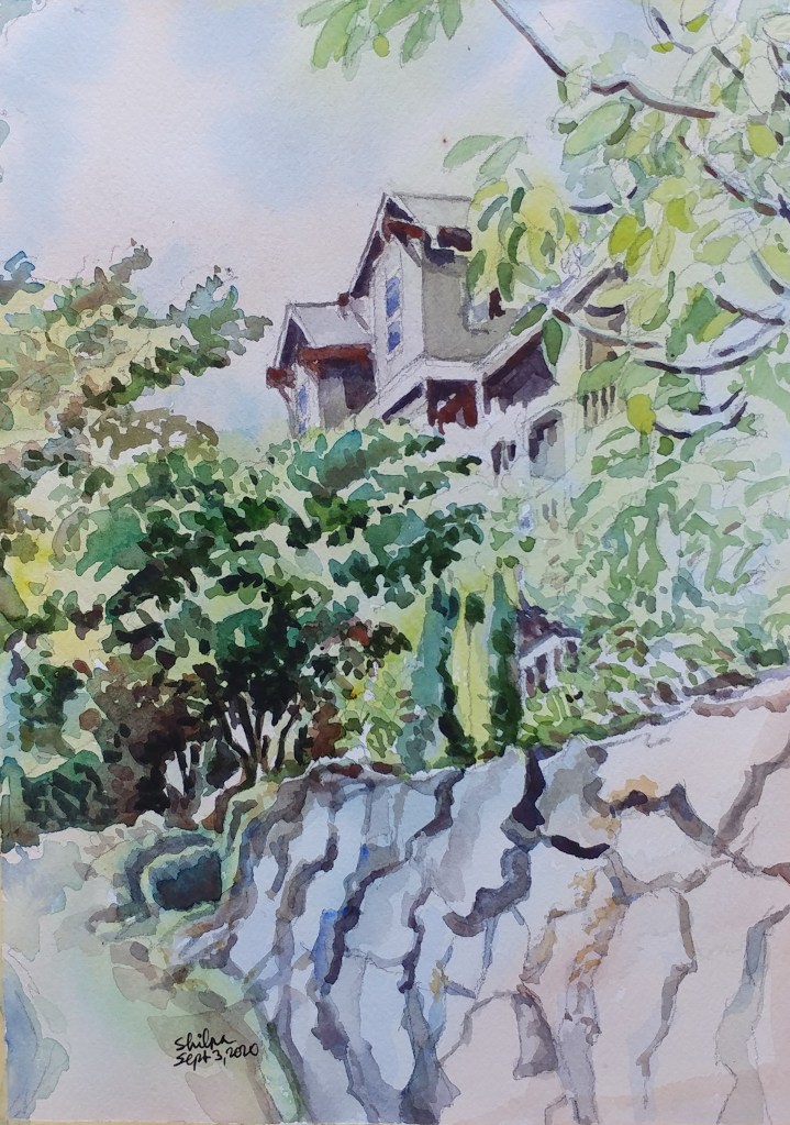
Chores and old dwellings
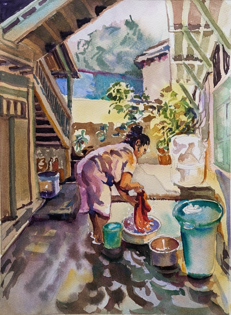
There is a sort of a charm in the dwellings that have been lived in for years and years. People have moved on, but the spaces show the old scale of structures and old style of doing things. Such spaces are narrow and the spaces themselves have been repurposed many times over by different occupants.
I chose this subject because it offered me to paint with a variety of colors, and I could present a sense of being in a narrow old space surrounded by wooden structures. The painting became all the more unique when combined with a moment that captures the focus of a domestic worker.
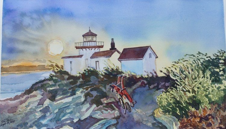
SeaTac

Have you noticed that a lot of watercolor artists paint airport landscapes?
The aerodynamic shape of an aircraft is very attractive and that is why they sketch or paint the scenes from the airport. I too had planned to paint such a scene sometime. The SeaTac is uniquely positioned because of the Mount Rainier being so clearly visible from there. I was at SeaTac recently and I quickly painted this scene in my small sketchbook.
Painting series of Planes
I like to usually paint the surroundings with a subject. It allows me to tell a story.
With this painting, I wanted to see if I could tackle planes that were immediately next and a little beyond and then further beyond, and ultimately, way farther beyond the subject.
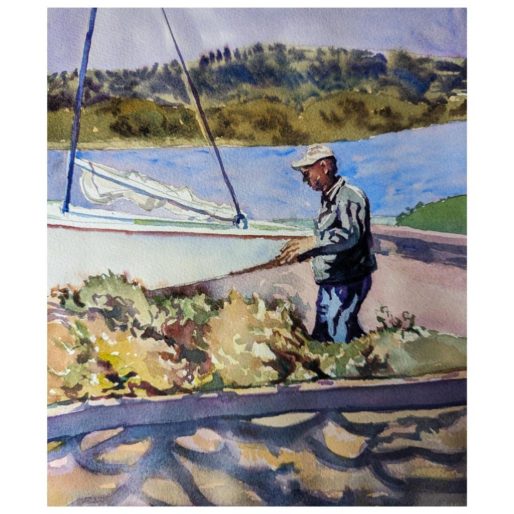
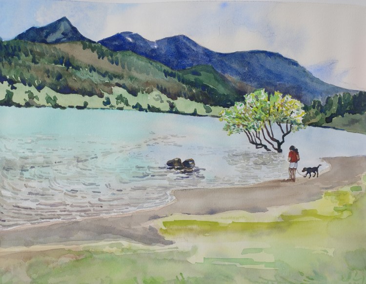
A man I saw pulling a boat to sail was beyond the shade, then the curb, then the shrubs. The lake was at a distance, and the mountains were much beyond the lake.
I had to veer away from the limited pallet in order to achieve it. It worked. As always, there’s always more room for improvement.
Painting a mountain representation – Story
What I thought would be one painting full of textures became a detail series of 7 or 8 paintings because of my insistence on perfection.
I wanted to paint a representation of rugged mountain. The photograph had a great composition. But the mountain was really a huge Mound that was itself a beast-like rocky terrain on an already inclined smooth slope.
I chose a rough paper. Then painted something that turned into a collage #1. But I thought I was trying to hide my painting flaws by adding a collage paper.

So, I chose to stick true to the shapes I saw and the colors I saw. I realized Burnt Umber was not an easy tone to work with! On top of that, I chose to combine it with Quinacridone red. The result was too much details with odd shaped rocks. Trust me, I was trying to stick to what I saw.
But out of frustration, I turned that into a collage # 2. Oh boy! It became overwhelming!! I even added lot of trees (true to the scene!). In the process I added too many colors. But this time, I liked the collage texture and how the colors worked together.
Then, I reminded myself: – that I want to learn to paint a representation of how the mountain ‘felt’ when I saw it. So I went back to the easel again. I thought of making the rest of the colors subdued this time. But I couldn’t get away from painting every rock. The result kept me still dissatisfied.
Then I literally washed my painting. The whole of it. And while it was wet, I added slightly wet pigment on dry brush. It gave a great ‘Pastel-Like’ effect to my painting. I was happy I discovered something new!
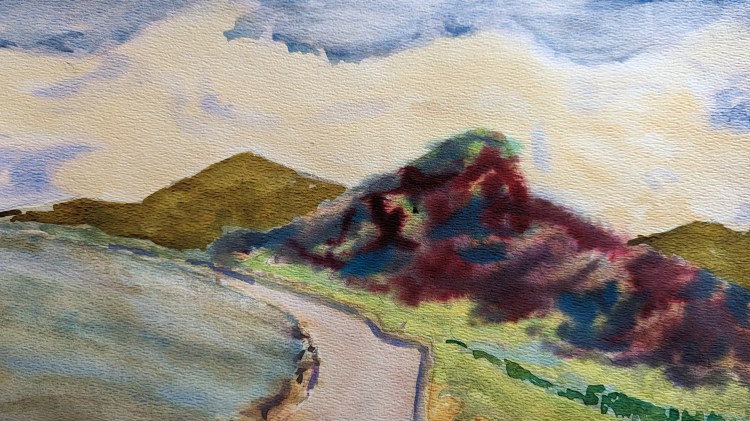
But I still wanted to paint a representation. I decided to focus on getting a good composition, and decided I wanted to use all the pigments I used and still get some details of rocks I wanted to keep. I liked how it turned out, but I am still not sure if what I painted gives a certain ‘feel’ of the mountain I intended at the start of the process.
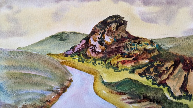
I finally created what I think is the best version. Here it goes.
Weekend vibe
I use a small pad for doing quick painting practice. I noticed that every time when I am focused on practicing more verses keeping the painting clean, I get great results 😀
I hope I got a good weekend vibe in this one!
Generative AI and Art
I was able to create an announcement to circulate on blogs, facebook and instagram using AI. It generated my portrait, my presentation graphic using fonts and colors, and created a video. The only part I created was the painting itself and a photo of the painting.
It’s not bad for when I need something quick!
Subject that stayed in mind
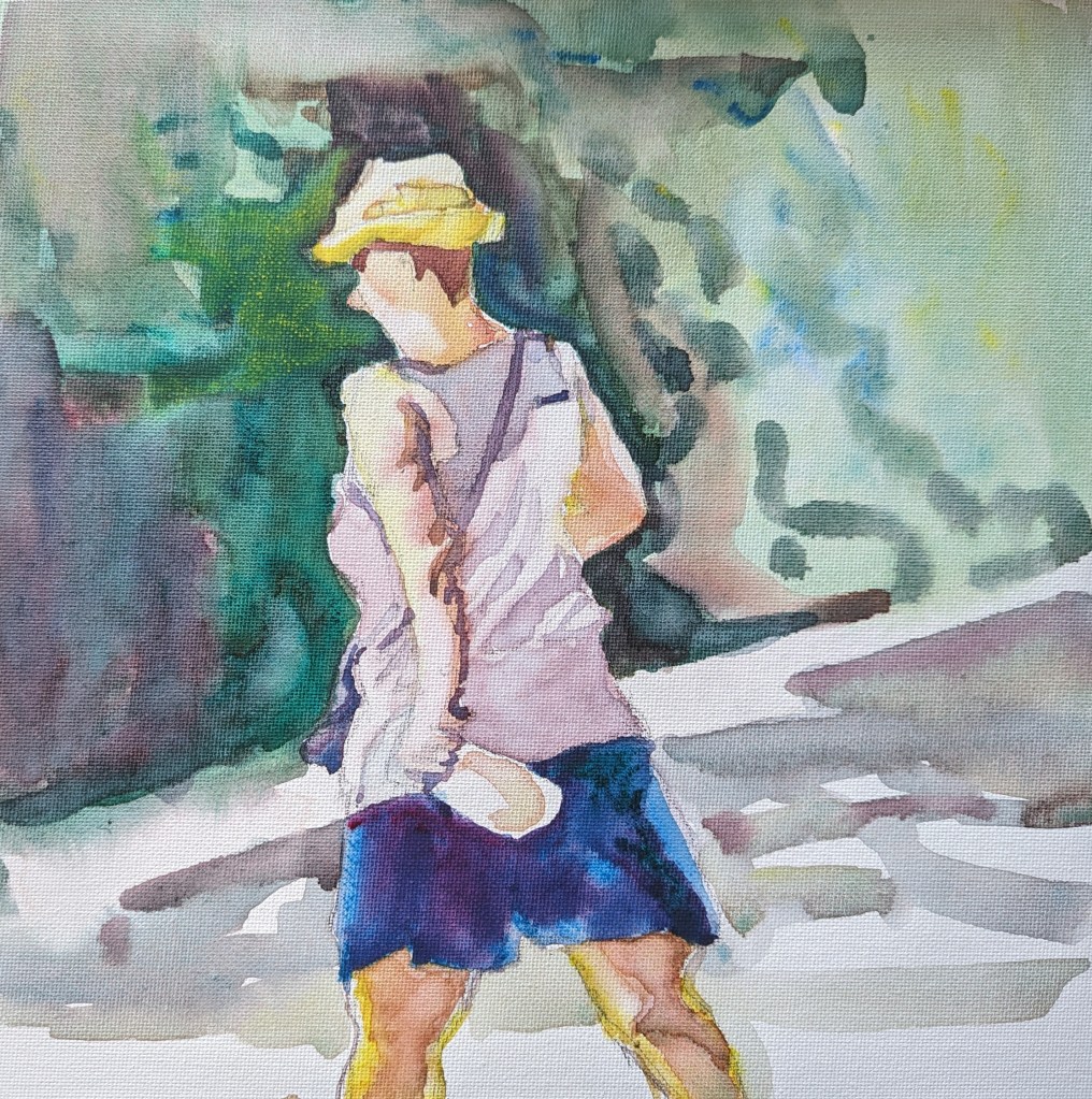
Last summer I saw this lady while I was waiting in the car. The way the light fell around her that day made an impression on me. I didn’t know what I was going to do with the subject. Her surrounding also was interesting.
I waited the whole year to paint it and made a decision to just focus on the lady. All I needed were mostly some greys and I was done! It neither needed much technique nor any planning.
Art show acceptance!
I am so excited to announce this good news I got last week! It’s my second time to be recognized. My watercolor titled “How she does it ALL!” has been accepted into Edmonds Art Festival juried gallery show! I was thrilled that my work received recognition into a prestigious art fair around Seattle area and it will be displayed in a largest gallery. I am now looking forward to the show dates – June 16-18 at 700 Main Street in Edmonds, WA.
Come and visit this fantastic and fun gathering of artists and art lovers!!
Gallery Artists List
Acrylics? Maybe.
Recently I decided to give Acrylics a second thought. With my passion towards watercolors, I was reluctant to paint in this medium and had reservations about the potential of it for my use. But an artist must grow and saying no to something doesn’t work for the growth. I took a 2-day workshop with the master artist Jed Dorsey (@jeddorseyart) who works in Acrylics. The experience turned out to be quite useful. I came out thinking that I do not have to give up my watercolor methods I use in order to work in this medium. It in fact could enhance my style of working if I needed to create vibrancy with minimum number of layers. Thank you @JedDorseyArt !!
Start_Acrylics workshop© Shilpa Bhadsavle 
Mile2_Acrylics workshop© Shilpa Bhadsavle 
Mile3_Acrylics workshop© Shilpa Bhadsavle 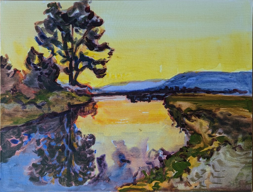
Final_Acrylics Workshop© Shilpa Bhadsavle
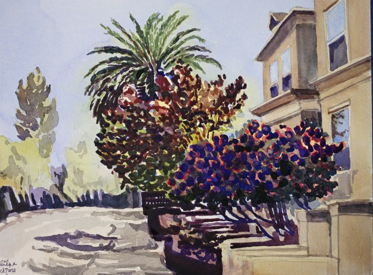
Evening Glow Organic Shapes
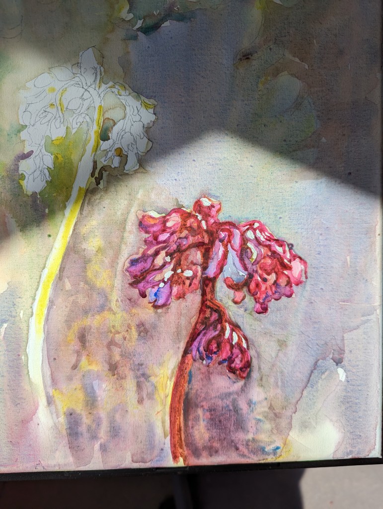
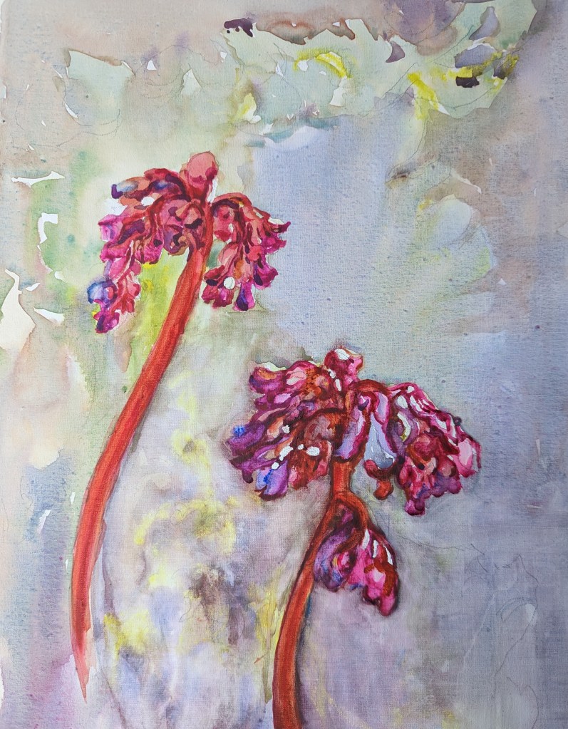
Bergenia plant is not very tall. What is exquisite about it is its flowers are in a bunch that has a very organic shape. What’s even more attractive about this plant is the 2 impossible colors combined together. Magenta and Orange red.
The colors glow in the evening light; and so, the name of the plant is Evening Glow. I had to make use of some blue to enhance both colors together. The hint of the blue was quite absent in the actual plant.
Popping color
Spring comes along and the freshly budding leaves show up with a shade so eye popping that I call it a ‘hungry to thrive’ green.
How to paint the eye-popping green expertly so that the color is not a distraction, and the focus of the story is maintained? It’s a challenge forever.
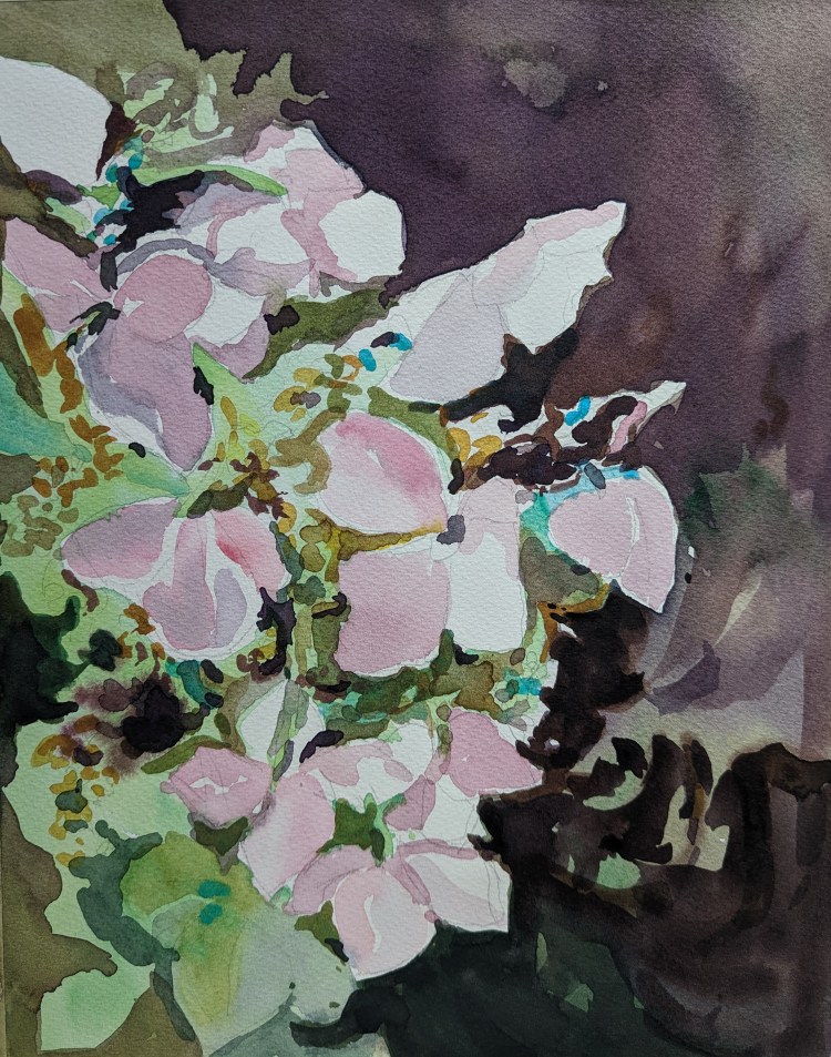
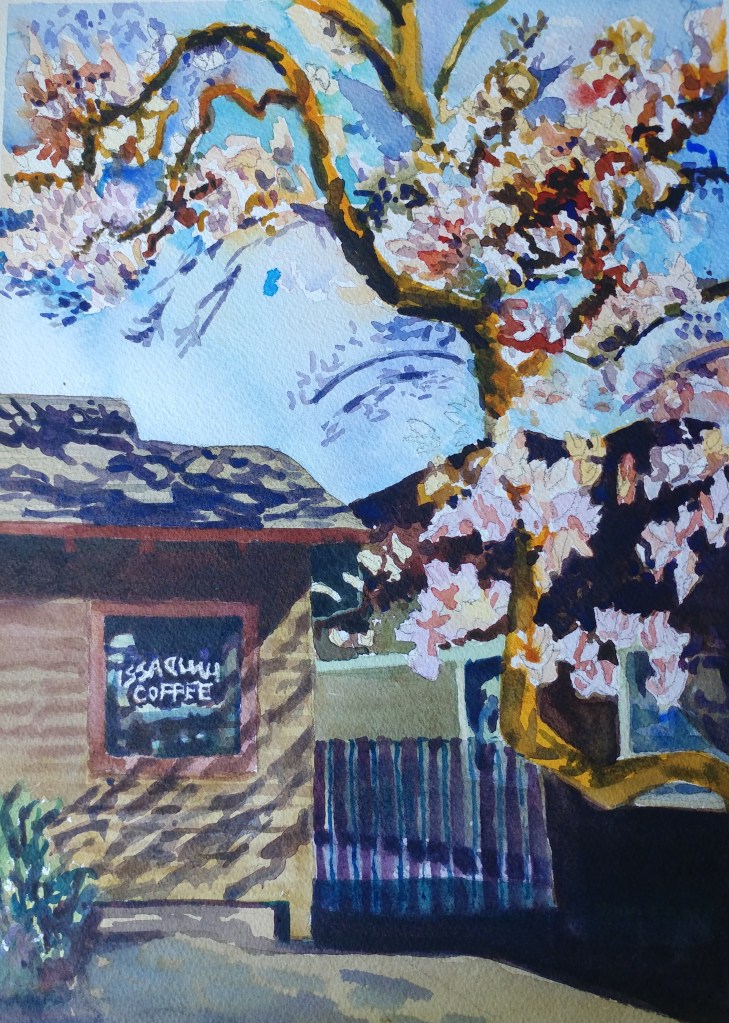
Delicate Blossom
Cherry blossom is a difficult subject to paint. Just like the blossom, the lightest of the light layers are required. I tried my best and liked the result from Study 2 and Study 3 the most.
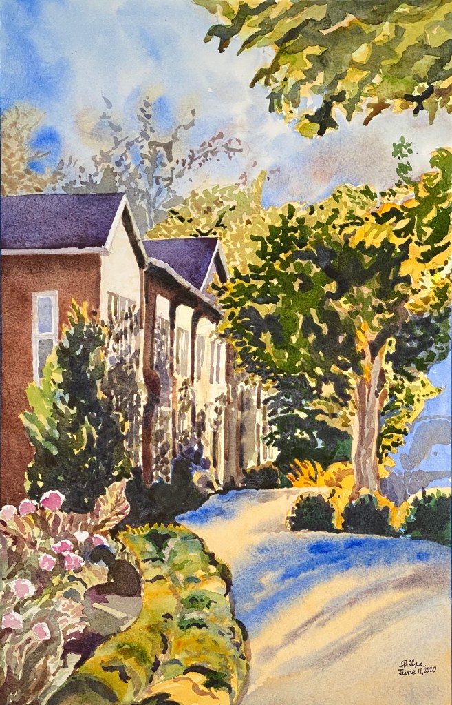
Sunlit urban
When I painted this one, I thought I was painting an urban scene with a ton of sunlight for the first time. Don’t know how I had not done that before. It was an impromptu decision to paint this without much planning and I painted it fast too. I like the way it turned out!
Faith and dedication
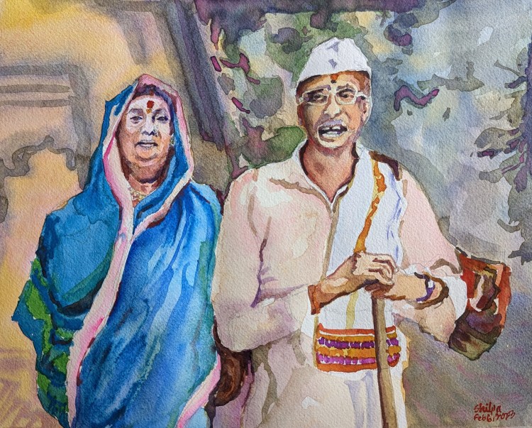
Can you take up a 7-day walking pilgrimage to a place of devotion without carrying any essential supplies and rely on the kindness of strangers to sustain during those 7 days?
Well, this couple I met was doing that. They are the devotees. Even though they could afford the supplies, they asked for bhiksha (donation, alms). They were headed to a place of worship called Alandi. They are the simple people from Maharashtra I adore. I couldn’t help but pour my emotions into this painting. Hope you like it as much as I do.
Pencil to brush

Estimating Values
I tend to paint extra dark because watercolor dries lighter. When I start out, I am quite aware of this fact, but I am guided by my intuition and paint lighter values actually accurately. But over the course of painting next layers, I make a mistake of layering darker values over the initial layer. That’s the habit I can’t get rid of.
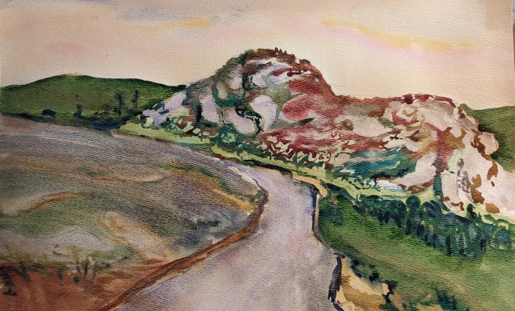
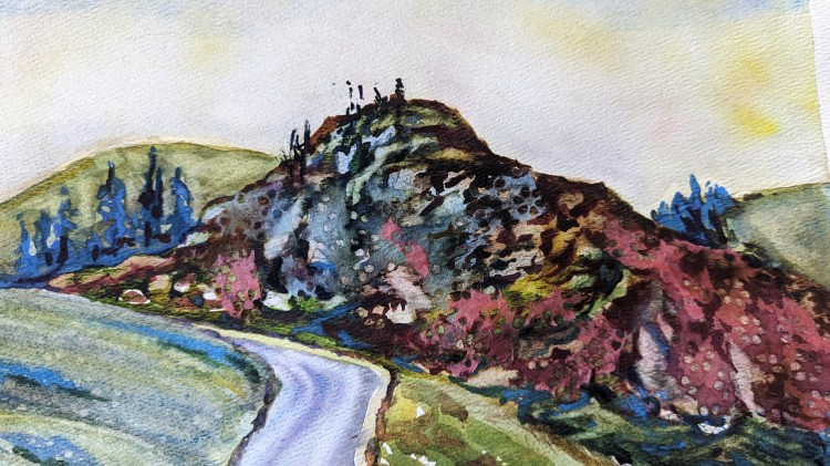
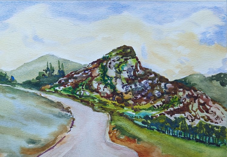
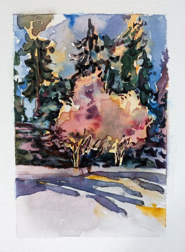
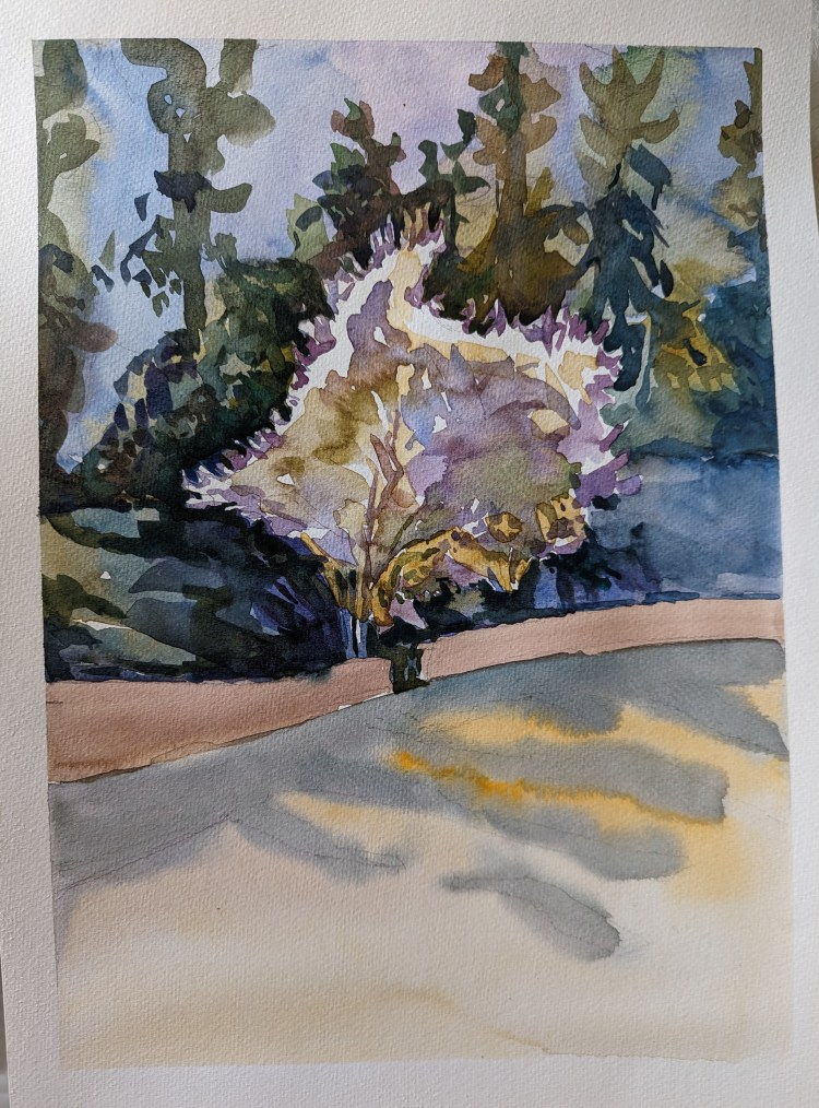
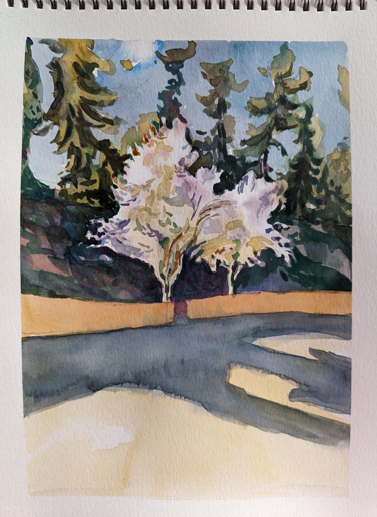
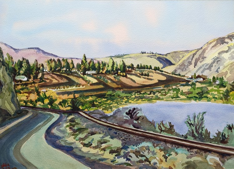
Not so limited palette
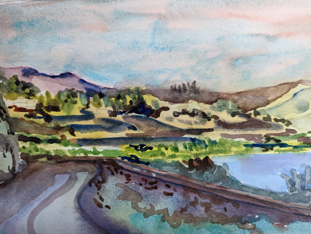
I want to be able to say more with less. But I am too conscious and too careful when I go from a rough study to a more detailed work. So I end up with an exactly opposite result.
With this series, I was experimenting with going away from limited palette. The road in the foreground being in the shadow could be dealt by veering away from the focus subject palette, so I used this subject.
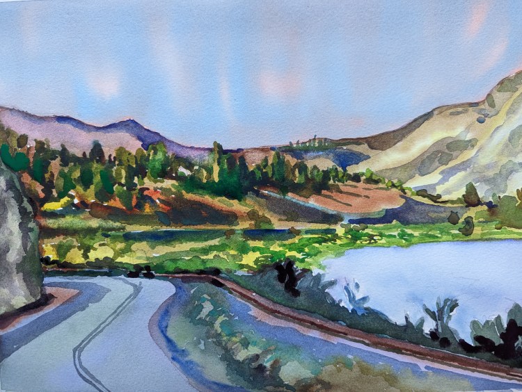
I painted and I liked how the colors looked in it. However, I was not sure if the viewer was able to enjoy the trees on the hill very well. So I painted another study – Study 2.
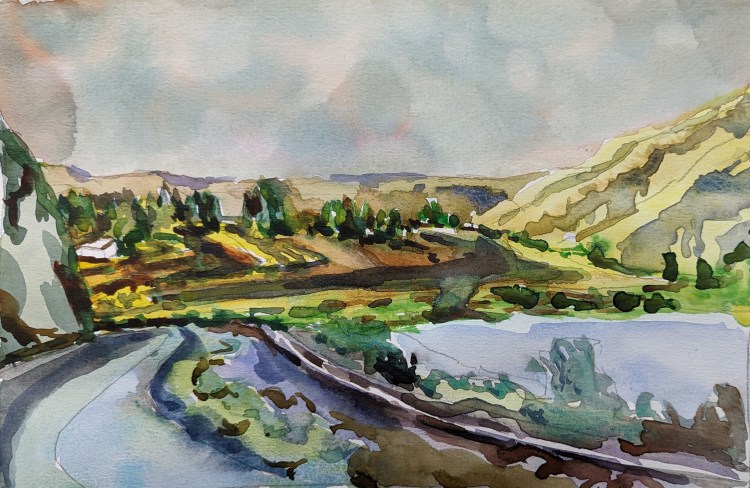
I now loved the colors as well as the trees in my study. I was ready to create a final painting. My resulting painting became elaborate. The simplicity of the study was lost in the final version, I think. What do you think?
Every Fall
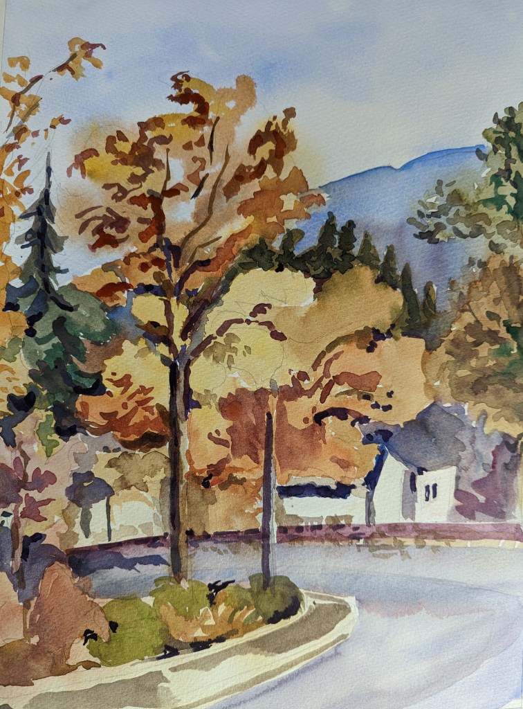
In the last 15 hours, two people suggested I paint a fall colors painting. I took it as a sign and stopped what I was already working on to paint this one this morning. It was a go with the flow (sort of literally with watercolors)! It has become a routine every fall, and now here’s this year’s.
African Landscape
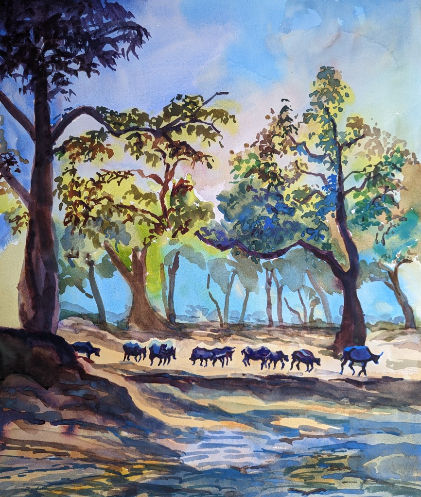
My general consideration did not include a buffalo as a subject to paint. Well, never say never! The African landscape I had seen on the television was quite attractive; and the buffalo herd was part of it.
Using some lovely pigments and a vibrant color scheme, I painted this scene without much layering actually.
No rules
I normally paint flowers a lot less. But they sure give an opportunity to use many colors. Today I went on painting with just a general idea but didn’t want to plan too much. Just stayed spontaneous. It helped that I had a good paper.
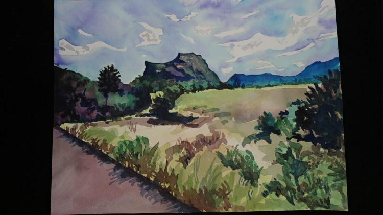
Boundless and limitless
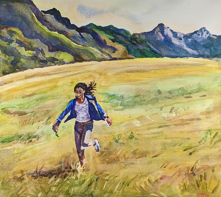
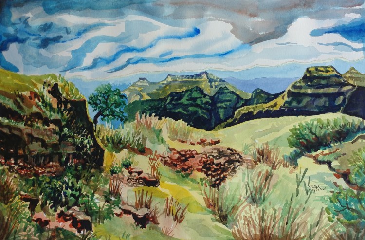
It is sort of a longing that lives forever in my mind. The sight of a boundless meadow surrounded by limitless mountain ranges. Such a landscape is an assurance that something larger than life exists.
I had to carefully use the color application technique in this one. Didn’t want to show everything flat for the grass; but didn’t want to use too much texture either. All this while balancing on the depth in the landscape and at a larger scale of paper.
Intuitive and Planned
I have a habit of painting in my practice journal first before doing a final version. Usually, the first attempt of the painting is a fast process and turns out to be a better intuitive process. My first attempt here with ‘Van Ness Living’ showed a really well-defined depth in the painting but the color on the focus area were left neglected. In the final version, the focus area was well done. The goal is to get it right the first time!
Fine line between the realistic and the abstract
I used a subject of a distant hill to experiment with colors, technique and style. I really wanted to stick to using just the pure pigments. No layering; not too much mixing either.
I did use a lot of pure pigment for sure. The first attempt was more of an abstract while the next one became more of realistic subject. I did make use of the layering technique in the second one. I guess, you can’t get away from its usefulness and you can’t get away from your old habit as well!
Summer light

I had a leftover good quality watercolor paper strip. I knew I would use it one day. This subject was perfect for it. I made use of the long length and got to paint the light effect of the lingering sun before the summer sunset. The painting is just 13″ x 7″ on Arches.
My Gesso trouble
It was on a whim that I decided to paint this subject on a watercolor paper treated with Gesso. But I wish I had not. The color shine on gesso, so this method looks so inviting. But on gesso, I wrongly estimate the amount of pigment on the brush. Gesso does not absorb the pigment very well, so it stays on the surface and does not blend well. I am not going to be tempted again.
Improving with the figurative style

I underwent a lot of thinking process and planning process before I painted this subject. By the second day of the painting process, I was exhausted. But I love the focus on the figures I have achieved. I am hoping the process will become easier for me down the road.
The subject is about Marathi style cooking from the state of Maharashtra. Each region of India offers an attractive variety with the cooking vessels and methods; something I am forever in awe of.
Spring purple
I had decided I would exaggerate the purple color in this one. So I chose simple shapes to paint bushes full of purple azaleas. But try as I might, I ended up with my normal style. I need to let loose even more!
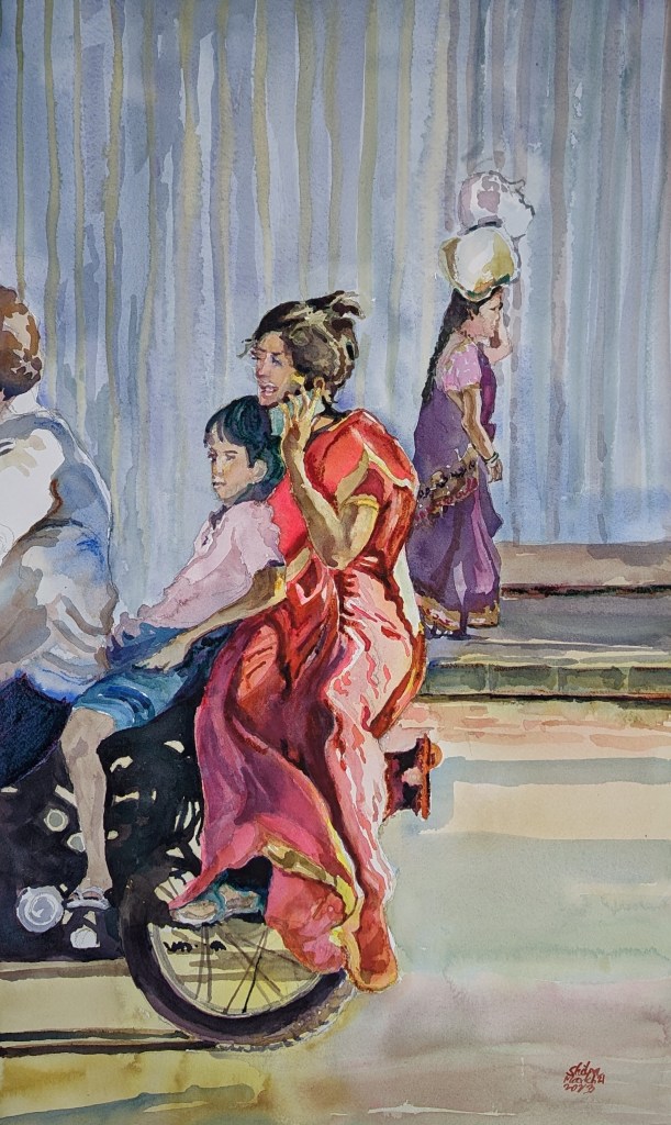
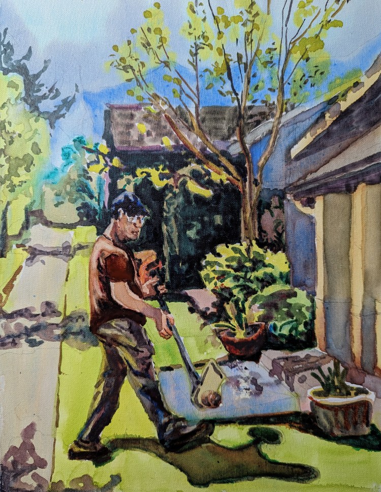
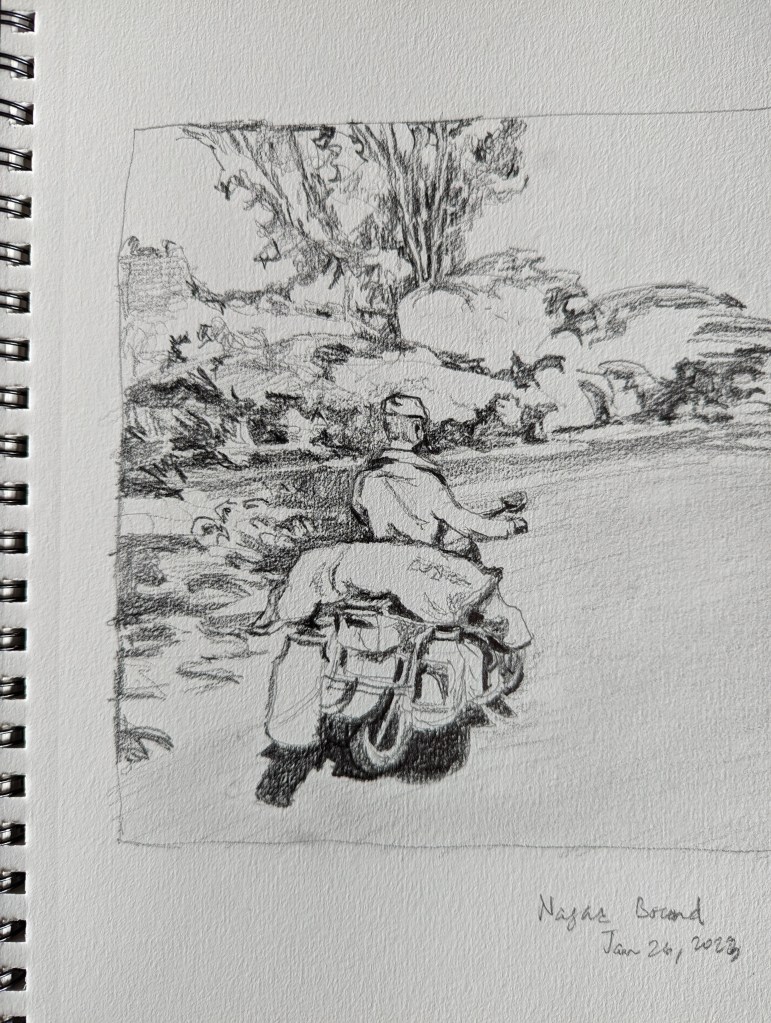
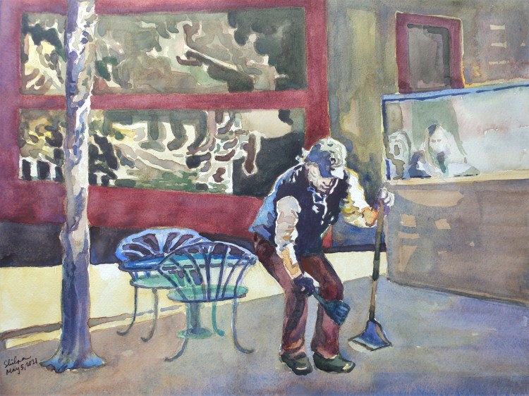
Work Ride
Dignity of labor. Is it possible to show dignity to people who work for less than a dollar a day? Thousands of years of history, and we still have this social ill.
Old Subject new twist

I have painted this same subject before. Now tried it with a twist, by painting it over gesso. The colors shine even more over gesso. The technique will need getting used to.
Devotion
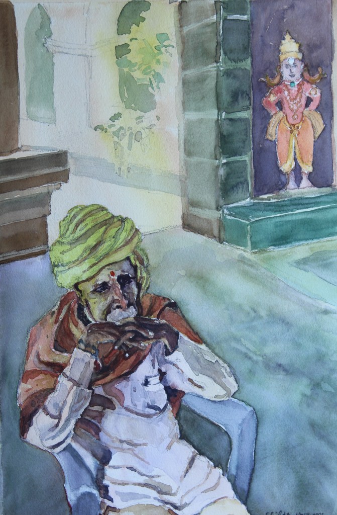
The idol was in front of him actually. But when it comes to the devotion, can the devotee and the object of devotion be separate? I had to break the rules of drawing a Perspective and change the angle of the idol to depict this fact. This man is a regular visitor at the temple I was at. He was totally present in the moment and I could sense many years of devotional life he may have led.
2 Steps Back
As I have progressed in my watercolor journey, I have vowed to keep it all clean, and focus only on fewer shapes. With this painting, I felt like I went back two steps. I kept painting each leaf. I am hoping not to do that. I started out with keeping the emphasis on the yellow pigment. But I loved the effect I got with Rose Madder in this!
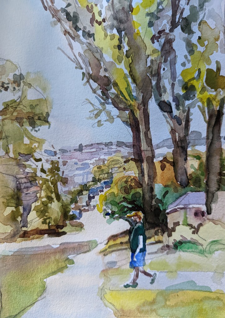
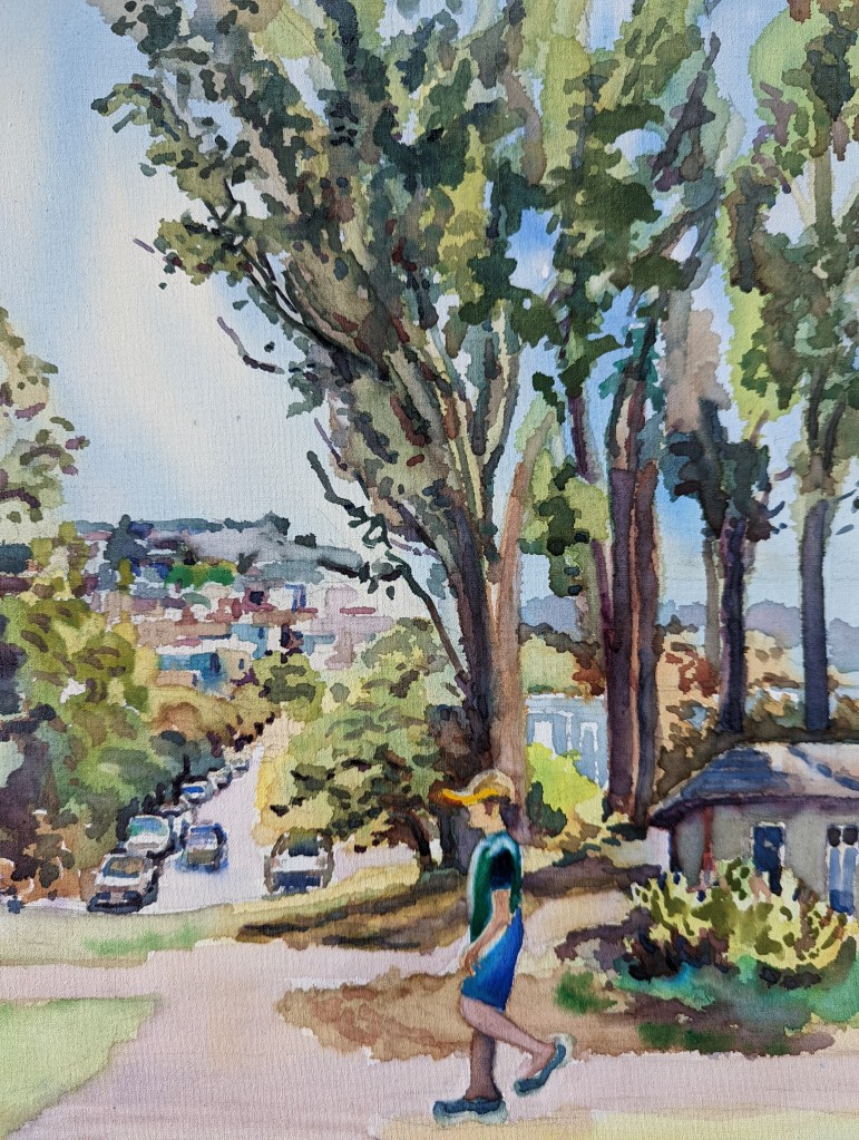
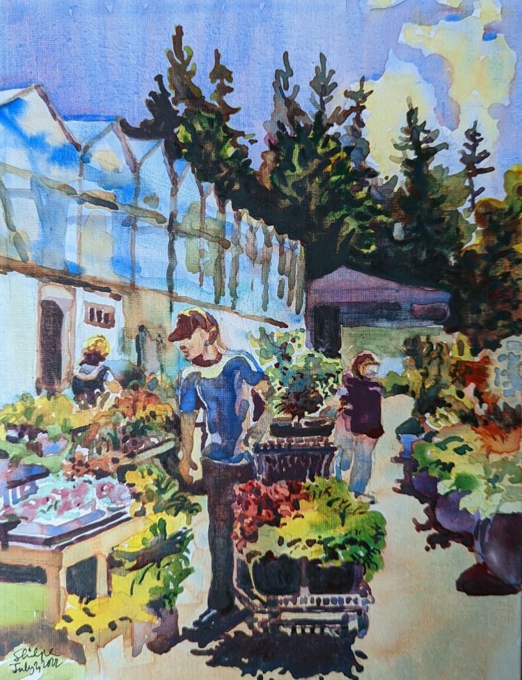
Balancing the foreground
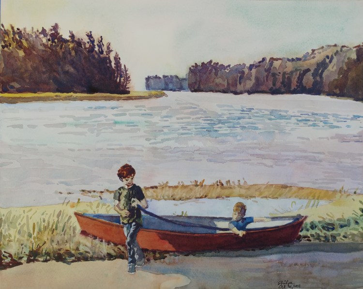
Every now and then I get a bit of a shock when during my painting process, I get a feeling that, what I thought would be an easy project is not turning out to be an easy one. The above painting had large shapes that are easy to paint; but that part didn’t help me. The foreground proved to be a lot harder task because there was the immediate foreground and the ‘slightly further out’ foreground with expert details needed for both!
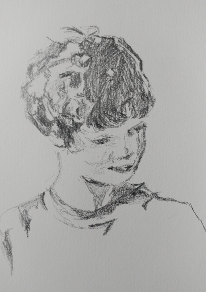
A side note worth sharing is that during my planning phase, I truly enjoyed doing a quick study sketch of the boy’s expressions.
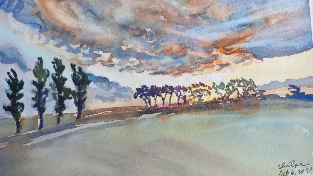
4 Days in the Clouds
This week I have been living in the clouds. That’s because I became obsessed with painting the clouds clean and seamless. The part about seamless has continued to be a challenge because in watercolors, I have to paint fast and make last minute decisions.
NZSunset_1 © Shilpa Bhadsavle. 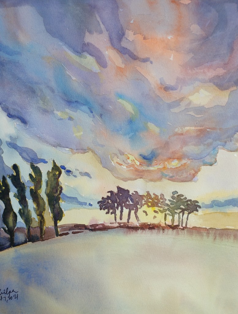
NZSunset_2 © Shilpa Bhadsavle. 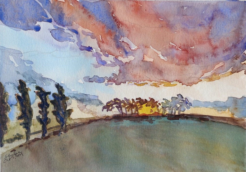
NZSunset_3 © Shilpa Bhadsavle. 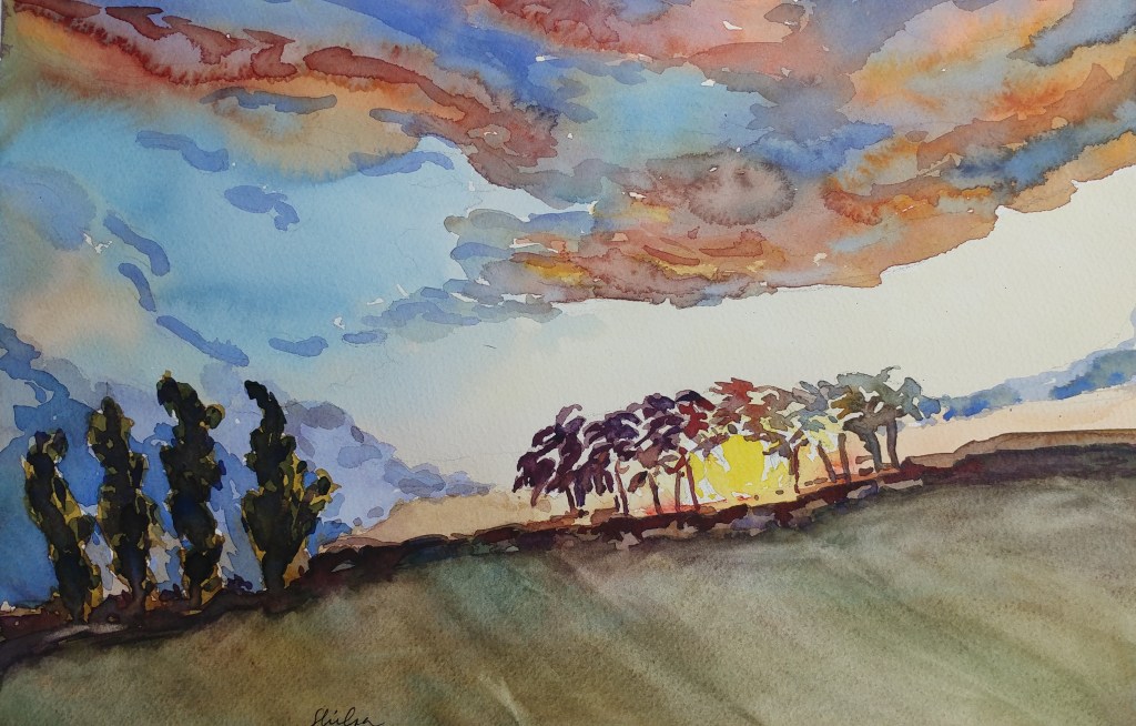
NZSunset_4 © Shilpa Bhadsavle.
But I have improved for sure with this exercise. I did my best with these 4 ones. This was NWWS topic to paint for October: A Sunset, so here it is.
Nuances to note: I love each one for different reasons. In one I love the clouds, in the other, the composition; in the third, my handling of the color accuracy and in the fourth my handling of the light effect.
Beyond the horizon
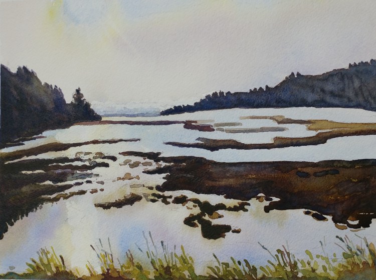
After seeing the beauty of the Willapa Bay in Oregon, I just had to paint the magnificence of nature that my eyes couldn’t get enough of. In every direction I looked, I was reminded of the holy principle working on this earth.
Fall morning
It really looks unbelievable; but in my opinion, sometimes rather too red. Once in a while during mornings though the mountain takes on the shade of golden beige and then the red color of fall trees falls into place!
September Topic: Foliage
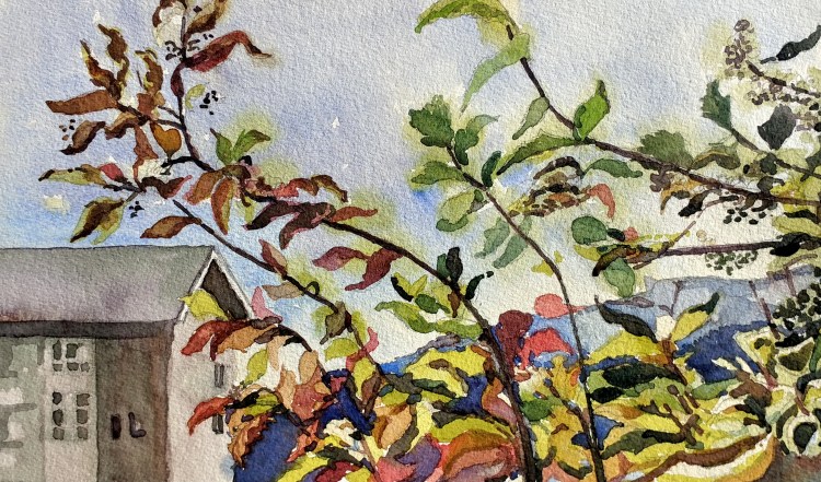
I have been meaning to paint the FB page of NWWS members September 2021 topic to paint ‘Foliage’. I did want to focus on the leaves; but not just the leaves only. So I painted the leaves against a good backdrop too.
The Absolute
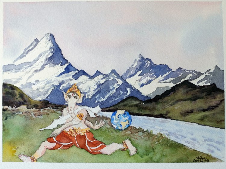
The depiction of Lord Ganesha with an adorable sitting posture, and a kind smile, and laddoos has a well won over place in devotees hearts. It will always be there. However; during this year’s Ganesha festival, I have been thinking. What symbolizes as an Absolute and what we look up to for removing obstacles, has to be more dynamic than we think. And so the above painting came about. The back pass has to be so precise and so well co-ordinated in order to remove the defender (obstacle); isn’t it?
Clean look
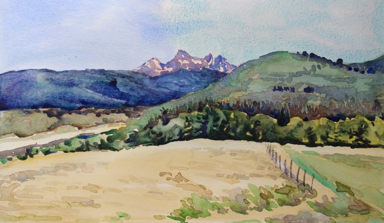
I was aiming to paint a clean looking landscape. Not many lines and objects and complications in the composition; but just a simple clean and effective look.
Painting En Plein Air, and more
I have begun to paint en plein air, and I absolutely love it! Posting here my first and second session! During the short time of the session allowed me to be more spontaneous and I discovered I was good at it 🙂
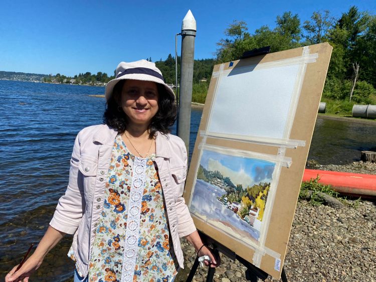
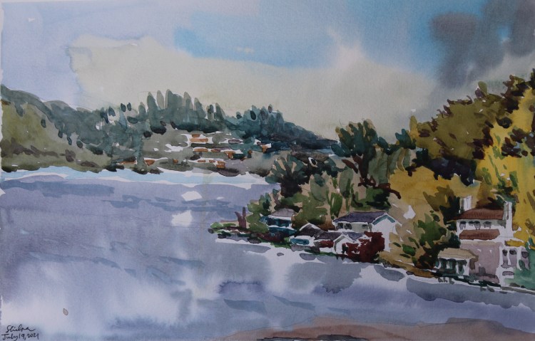
Lake Sammamish © Shilpa Bhadsavle.
The second session was at a lavender farm. It was a great colorful subject and it worked out so well!
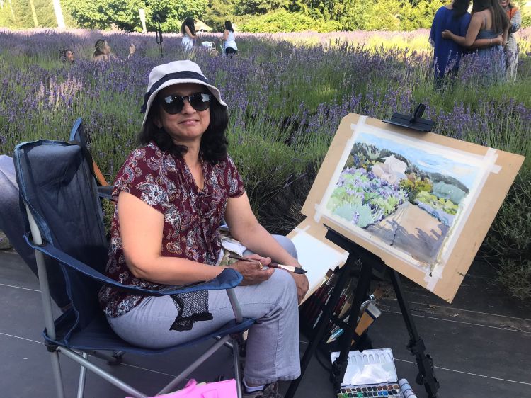
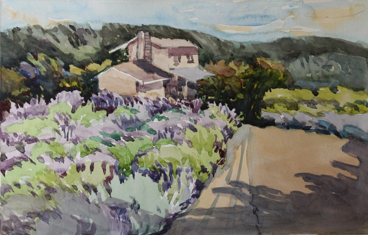
Snofall Lavender Farm © Shilpa Bhadsavle.
I was so encouraged by the results that I used the ‘fast pace’ in my journal on a portrait subject and that too gave me a great result!

Terrain with a background

Quite a laborious process it was. A big juggling act between painting loose, getting the larger landscape with figures accurately, and all the while adjusting the colors to a correct value I wanted. I painted 5 versions of the same scene. I surely learned a lot in the process though!
Take 3
I was not too happy with the results of the first one because the paper I randomly found and used for it turned out to be 20 year old. The take 2 had a great paper but I chose a wrong pigment. With take 3, I got the effect I wanted.
Phew .. !
Old paper, old technique
It was a moment of epiphany. I had slacked and painted on a stashed away paper I found. It so turned out that it was a 20 year old paper. I painted in my usual style. But the result showed the paper’s dated look. Then again, my painting style too showed the sameness (Done that. Way too many times…)
I need a change.
Spotlight
One early morning I woke up to this sight. While the rest of the house was still sleeping, my kitchen had only one spotlight! Lo and behold, it was on my favorite object of ritual! I couldn’t help but paint this scene 🙂
Light pink in the light
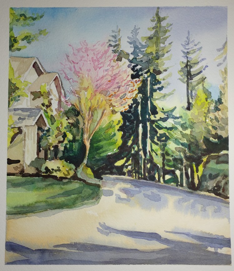
Another one of the pacific northwest spring scene. Pinks are so light that they can never dominate the abundant green all around!
Reflections that shine
When the light falls on objects across from the dark glass window, the window shows reflections that are abstract. But they are something you keep staring at. I aimed to capture the reflection of a shiny building in the window. The red color of the building added interest. Also, the plastic partition meant for covid gave this subject another challenge for me to paint!
Reality or Dream?
When some weighty matters are on our mind, we tend to forget to look at the reality using the lens of logic. Our emotions take over and we seem to ignore the true beauty of everything. We might as well be dreaming while being fully awake!
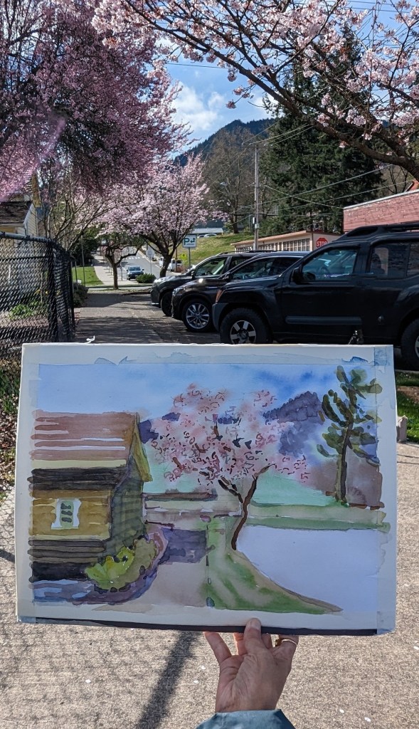
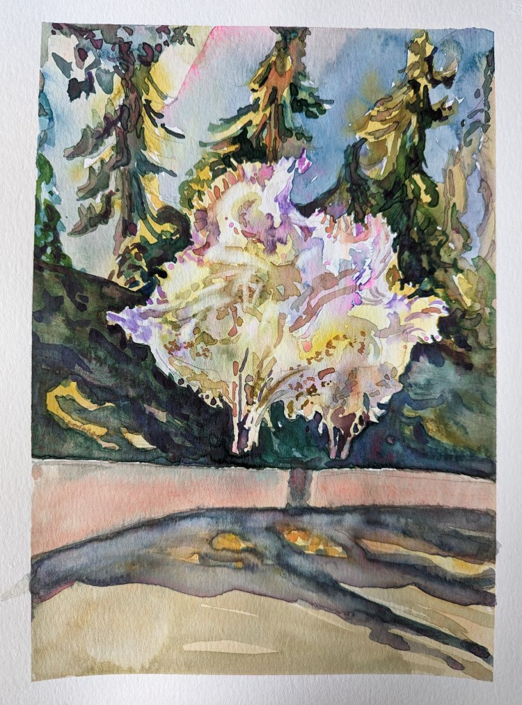
Alexandrina Magnolia
Alexandrina. Quite an exotic name!
It’s a variety of Japanese Magnolia that stops me in my tracks every spring. It is a large flower that blooms upwards. Shaped a bit like a lotus, but this one blooms in so much abundance that the flowers blend with one another, and it is hard to focus on just one of them!
I think, therefore I am. – (René Descartes)
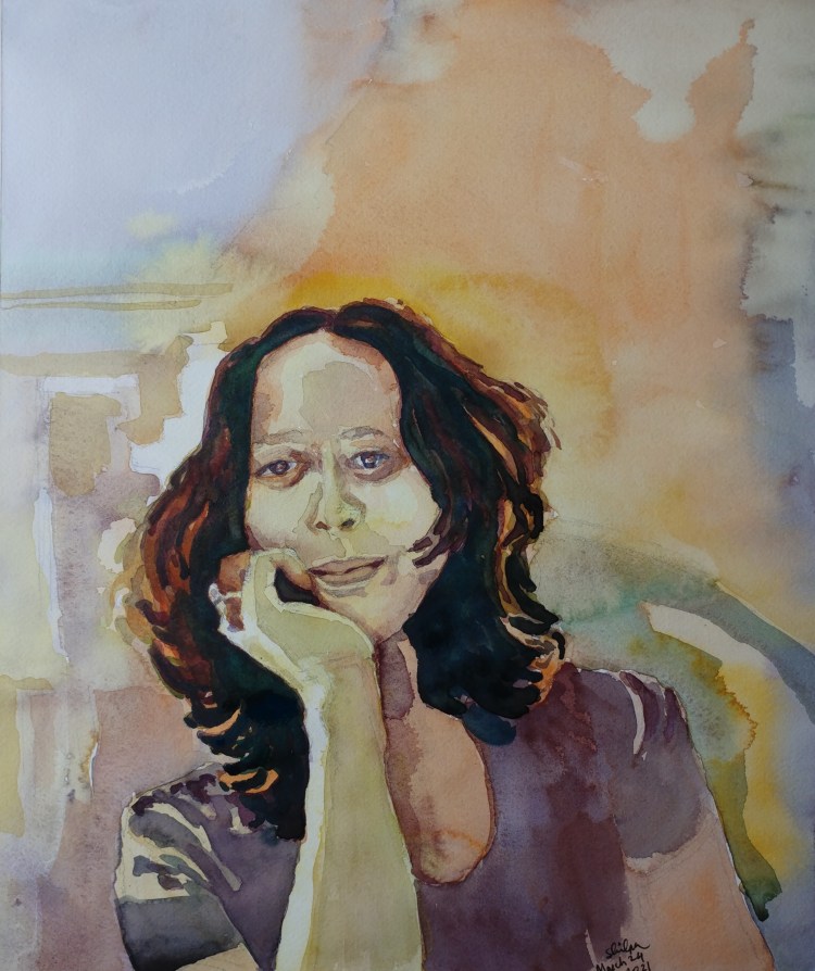
I tend to think a lot before I paint. Also, this pose location in the photo had a source of back light as well as some natural light. It required an interesting color scheme that made me think more before I painted. I tried to paint self portrait seriously for the first time. (And I forgive an overzealous painter in me who may have made myself look different :))
Indoor light
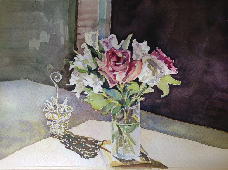
Lately I am getting obsessed with painting the indoor light. This flower arrangement was a great subject because I could aim to paint what glows and what stays in the background.
Sense of place
Historic buildings of architectural importance usually have such a scale and character that the sense of place of being there becomes imprinted in our memory. I wanted to paint this Rijks museum moment of outdoor light brightening up the structure inside.
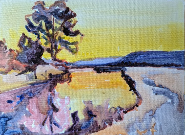
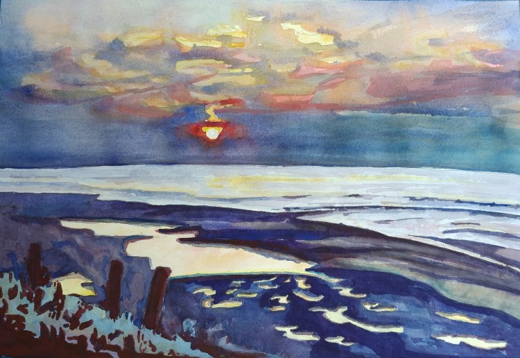
Assurance
Darkness is all around, and increasing by the minute. You want to hold on to the daylight, but you know it’s not possible. Right at that moment you suddenly see this golden light. It feels like an assurance from the sun that he is going to be back tomorrow.
Continuum
This tiny 2′ x 3′ window that I have. Located much above the eye level, looking at this window is unavoidable throughout the day. Covid days gave me an opportunity and I kept a record. Nature offered a continuum of magnificent beauty. Weather changes, season changes, time changes, light direction changes, foliage changes – time lapse of continuous beauty all through this tiny little window.
Sunbreak
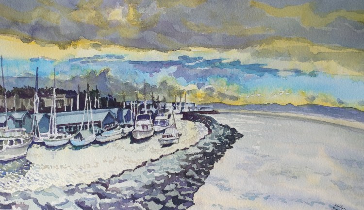
There was an attractive blue color band in the otherwise winter grey sky. It came about because of a sunbreak in the clouds. A challenge to paint for sure. Plus, I was going to paint the sailboats one day anyway.
Sunlight, Mist, and Shadows
In winter, the mornings display a variety in the scene. Some days they wear a grey blanket and the other ones bring darkness of rain in the Pacific Northwest. When the sun does shine, the early morning is a beauty. The tree stubs and branches form a weaving pattern, the mist lingers, and the sunlight brings out the delicateness of nature as it’s still waking up.
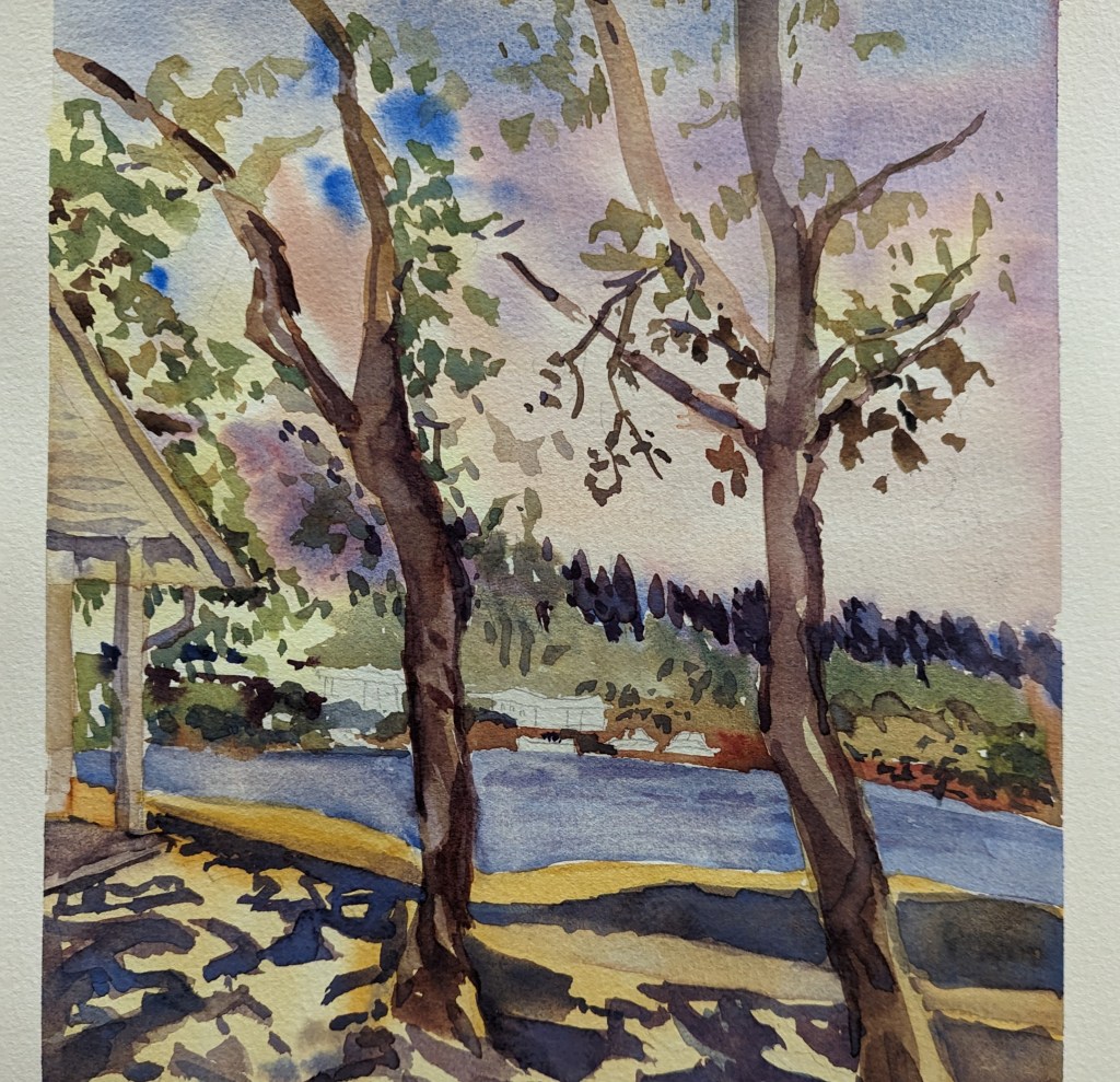
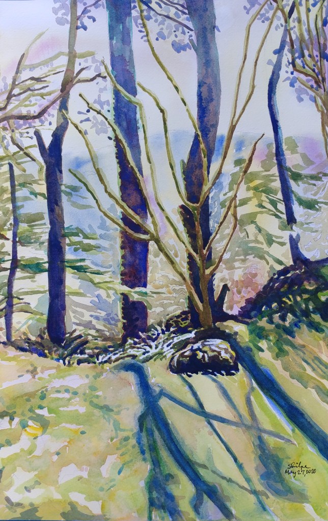
Long Shadows of Winter
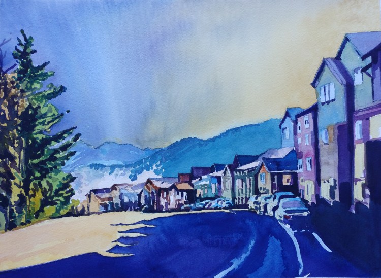
As the sun moves farther to the south, the shadows grow so long. I planned to capture this nuance. The above scene of a view from the hilltop added great drama to the sweeping shadows. Rather unintentional, but my washes for the sky too gave an extra touch to the drama I wanted to create 🙂
Quick Application
(Note: Next few weeks I will be posting some quick ones. Other occupations have cut down my time for painting to 1/3rd!)
Yellow trees in fall are quite mesmerizing. They stop me in my track when I go for walks. For quick application, I used wet on wet, faster strokes, no waiting in between washes. Less finesse, but still gives an overall mood of the place and time.
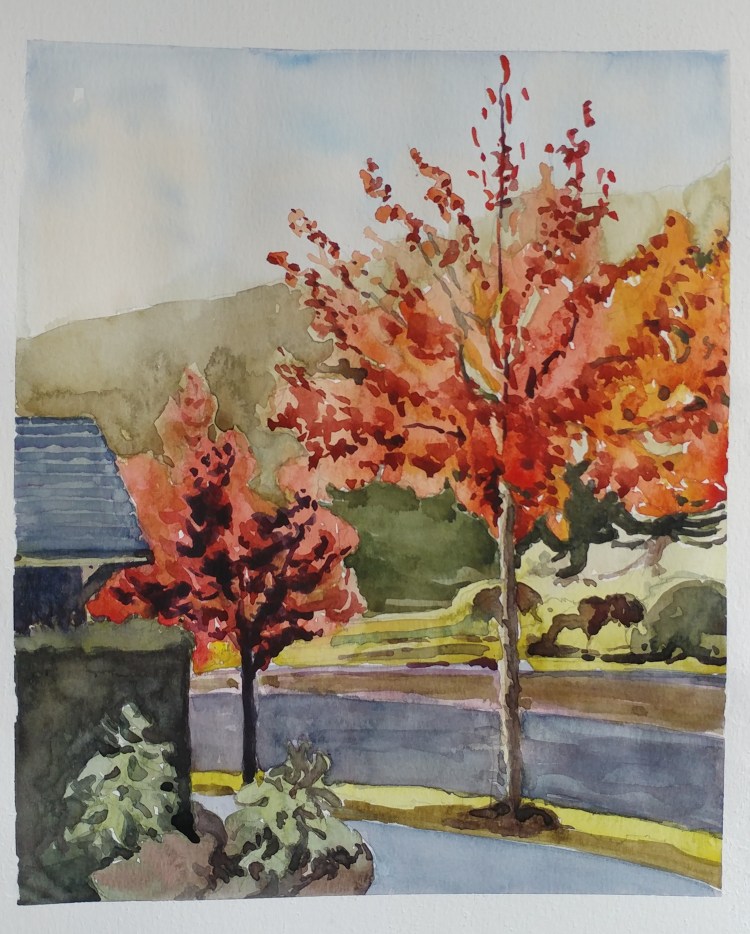
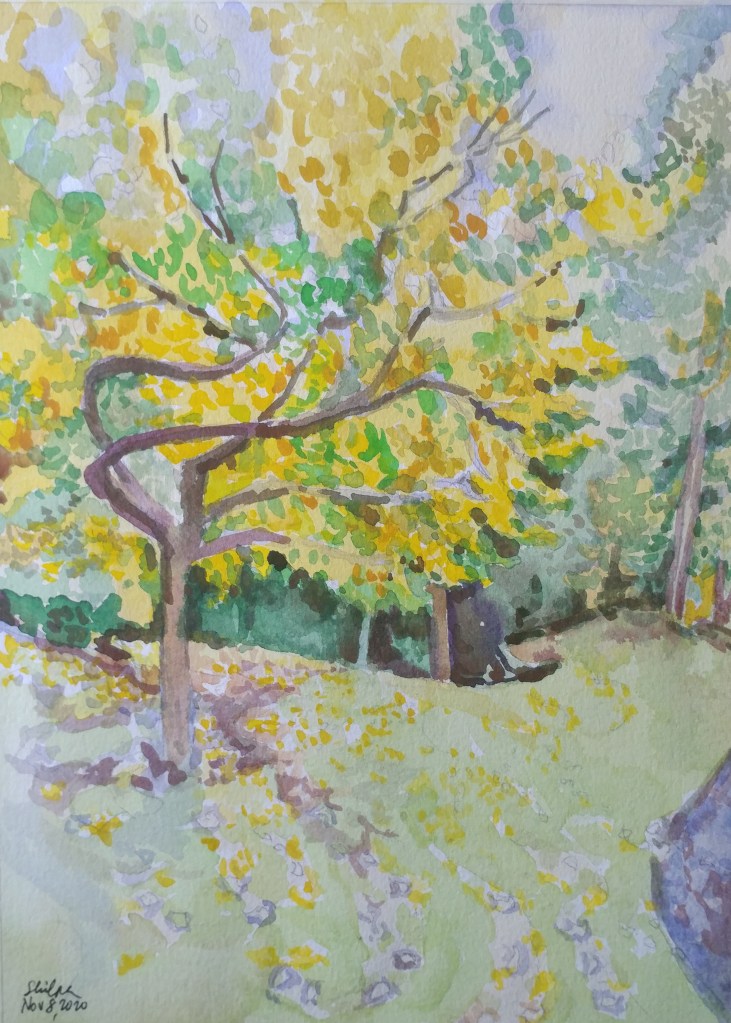
Fall Splendor
The trees have stopped cooking food. But it is a visual candy-land to the viewers! I can’t help it but paint yet another of the fall scene. Although my preference is to paint yellow colors of fall, on my walk this week I saw these brilliant red trees lit up with sun and offered me a spectacular scene that I took on to paint right away.
Painted Skies
By far, I find that painting skies using watercolors is a project full of highest nuances. How much water, how quickly and how efficiently controlled; and not to mention pigments, mixing, and layering variables. I try everything because I am learning. I wanted to get the dynamic sky at sunset I had seen. I may take this up again to try a different technique.
Steep Gables
I absolutely love looking at the steep gable roofs constructed in the snowy regions of the northeast. Their size is bulkier than the structure itself. Funnily they become lighter at once when they have these little windows jutting out of them. Makes me want to sit by those windows and cuddle up with a book!
Problem with purples
Blue and purple flowers when located in shade or under cloudy skies have been difficult to paint for me. I remember once spending a lot of time on purple irises without a desired outcome. When I saw a shrub totally full of purple flowers last week, I decided to give it a try again. I like this one though.
Under the maple in fall
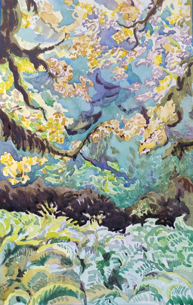
I saw something magical. There was rain and mist in the air, and I was standing under the maple that had mosses growing on it. Usually, it would be pretty gloomy. But the little light that was falling made the ferns shine and the fall colors of maple gave the scene a dreamy look.
Secluded Habitat
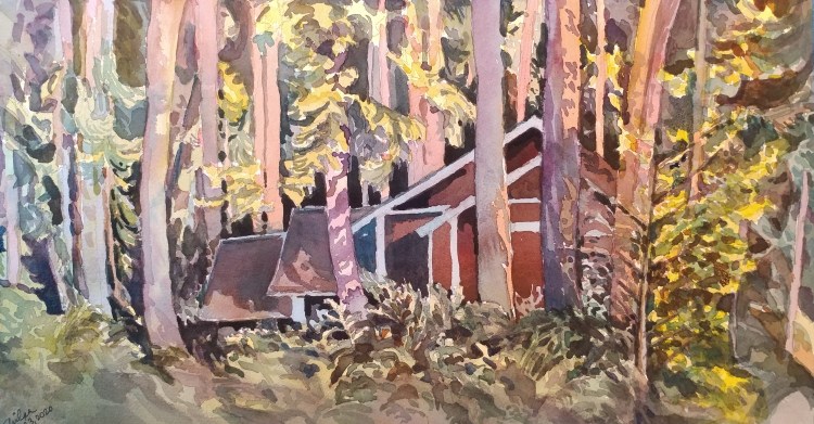
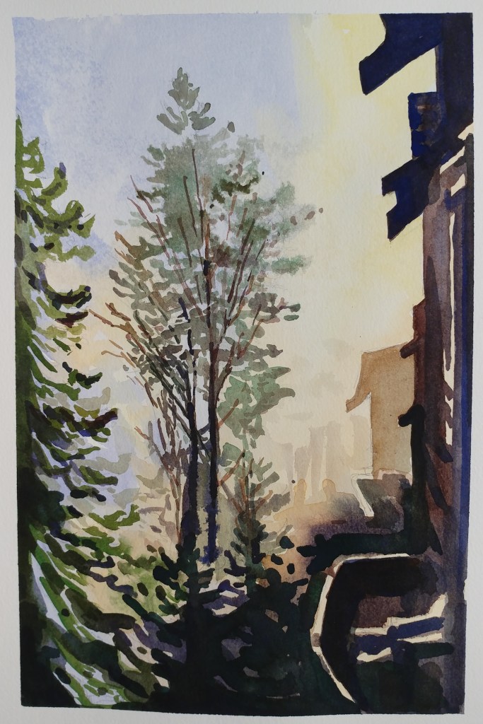
Angle of light is everything with watercolors. It is easy when the subject of the painting is well lit. But when the light falls from the gaps formed by tall trees it is not easy to determine which are the shaded areas and which are the lit ones; so the final result was a mystery with this painting. I took this subject as a challenge. It was a cabin that was tucked away.
Riot of bold colors
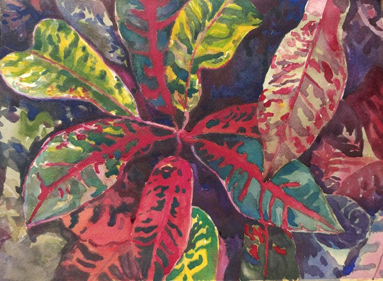
Croton is an ornamental plant that produces leaf colors that range from yellows to pinks and magenta reds and browns. And Crotons have them all in one when planted mixed! It was a great opportunity in this subject to make use of many colors.
In retrospect, painting maybe just a couple of leaves would have been a better choice. Multiple colors in a painting do not necessarily mean they will appear harmonious; and our eyes keep moving and wandering all over!
Anxious every time
You will not believe me if I say this, but every time I start a new painting, I get so nervous. Just like when we try to ride the bicycle the second time after we learn it. Even after so many years of painting, this anxiety still bothers me. Maybe it happens because of my complicated subjects. But oh well, I am done with this one for now 🙂
Softer and Subdued
Many of my paintings use intense colors. It is my natural tendency. This time though I intentionally went for a softer look with a fast turnover. Another aim was to make use of rather earthy pigments. Overall, it was a smaller painting but I did get the result I wanted.
Chilled Inside and Out
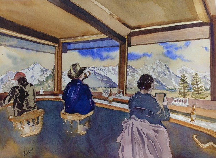
In front of the majestic grandeur of the snow capped mountains we become thirsty eyed for more. Refreshing peace lingers in our mind. On top of that, if our hunger and thirst of the stomach kind is quenched, what more do we need?
Ancient Indian Art and Dyes
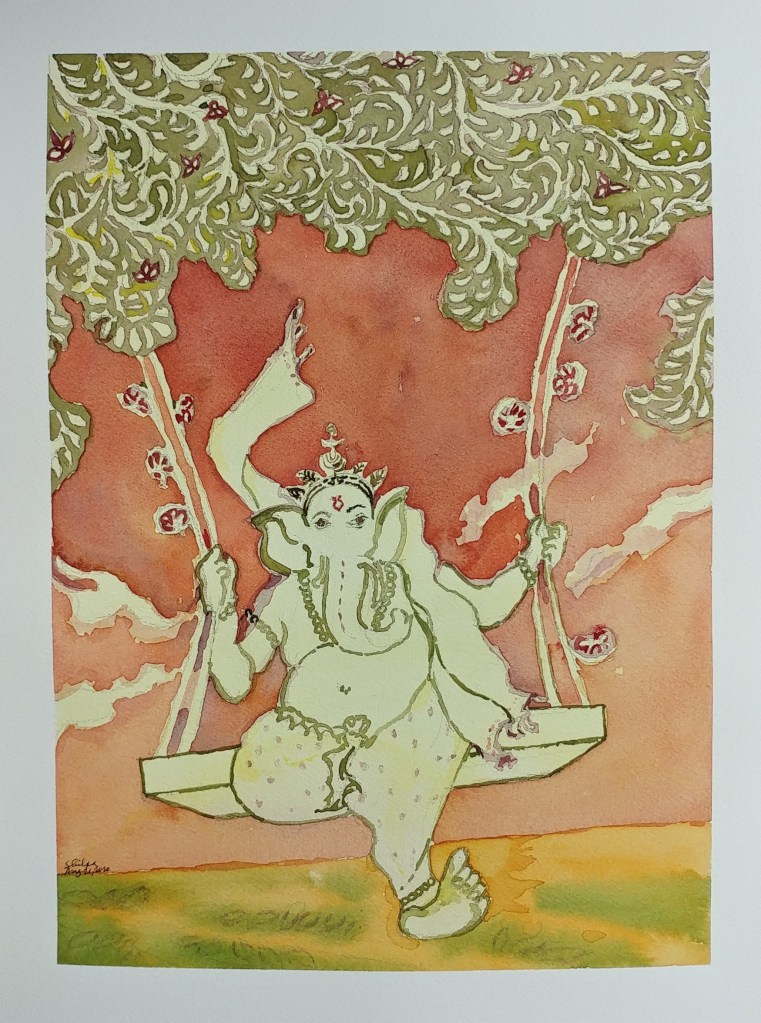
I recently learned about the dyes and painting styles of ancient India. There have been so many formal and many more informal traditional styles and I was truly enamored by them. In the modern age, I feel the techniques could be kept with the new subjects added. I tried something along those lines. Right on time on the day of the festival, may this Ganesha bring you what you are searching for!
King of flowers
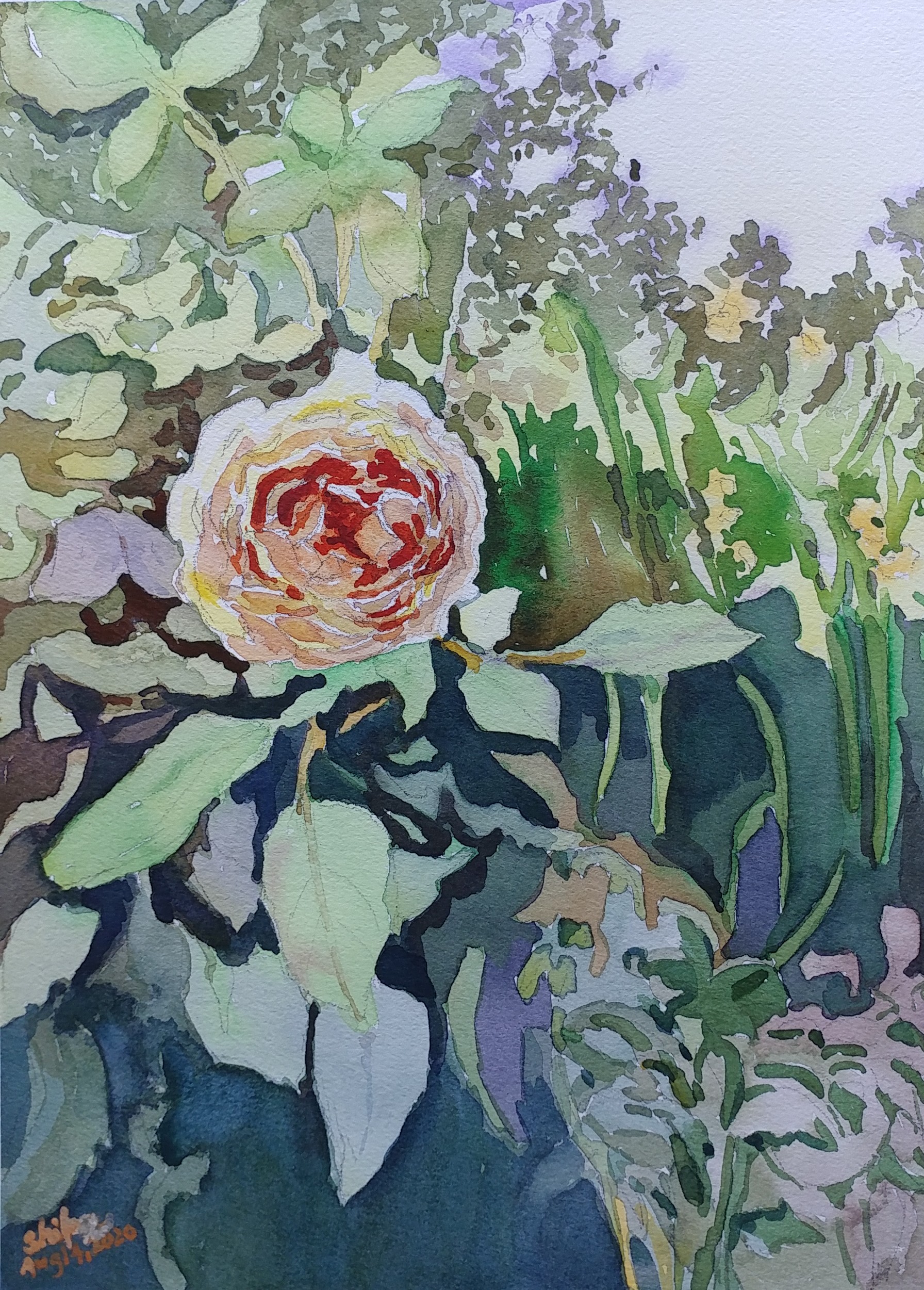
Layered petals that form an intertwined center. No wonder Roses draw us in. Most watercolor artists paint them at least once! Here is what I came up with. The rose that was peach in color.
Backyard that’s far away!

You are aware that the giant is there. Most of the times when you look for it, it is behind the clouds. And suddenly when you look in your backyard one day, it is totally visible. You feel the scale. It looks much closer; and yet it is at least 100 miles away!
Bygone Eras
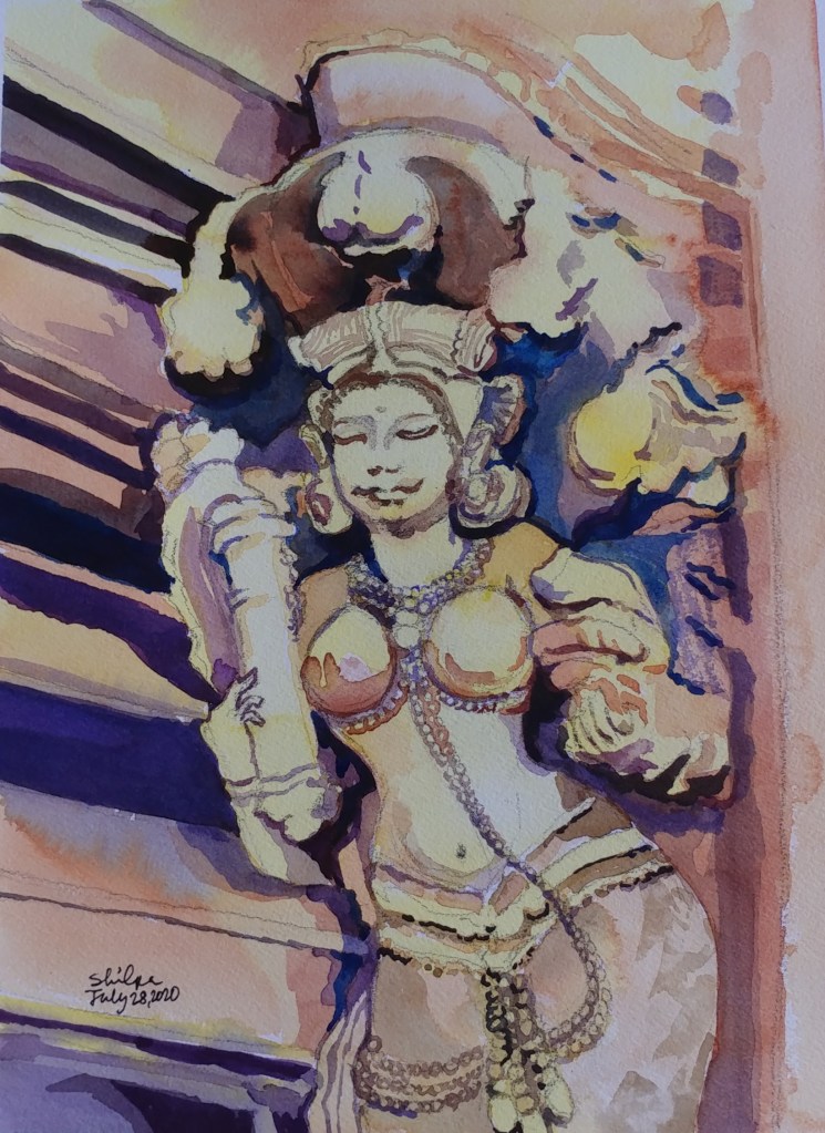
She caught my attention right away. Among the numerous sculptures carved during the Ganga dynasty of 13th CE India. Every sculpture was part of the royalty scene. This one though must have meant to serve the decoration around the royalty. Almost an advertisement of some sort.
Vantage Point
I stopped myself before I over-painted. It was my 3rd try. I had felt a compulsion to try this vantage point in watercolors. It worked a lot better when I stopped glazing over.
Borrowed charm
It is always the mix of geometric patterns and colors of artificial lights that’s captivating to the eye. It always casts a spell on me. This Urban Glitz. These days its there still; but now all empty. Wondering if it is going to be repurposed for something else in the future….
Achieving the sweet balance
I am not there yet. For the most part, I do get the mood of the painting right. I have got it in this one all right. I need all elements though. Finesse with washes and getting the EXACT intensity of color at first go. I will be keeping at it surely.
Unconventional Landscape
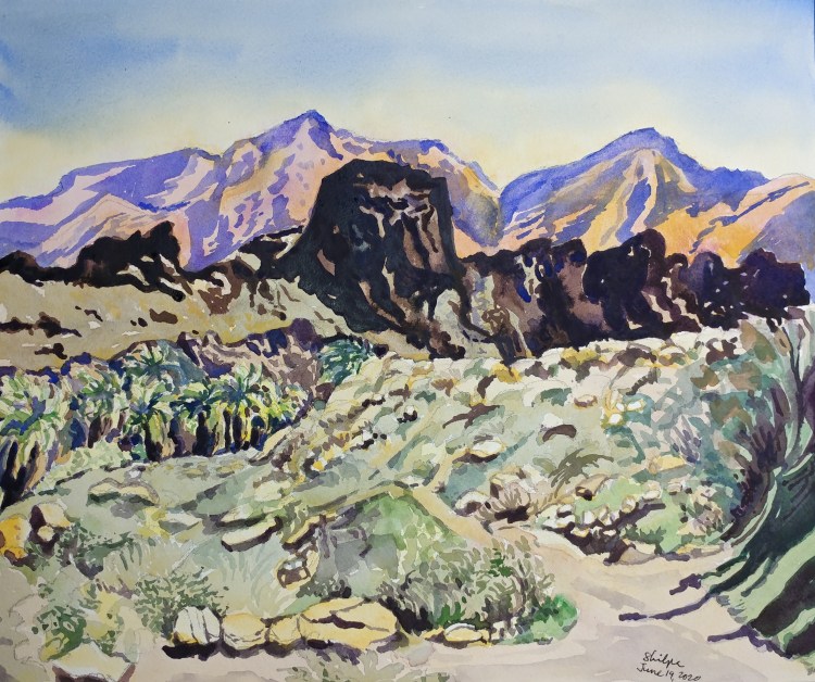
One smooth pink mountain; another one quite rugged and brown right next to it. Grass of unrecognizable colors, and fan palms growing in the canyon. The landscape is far from conventional at Palm Springs, CA. Its unsettling to grasp and to paint as well.
Afternoon Glow
My painting process changed for this one. This time around I started with the ‘effect’ I wanted to paint : Glow of the light all around! Then I searched for the subject. Then I looked for the perfect moment to click a photo. I then went to my easel to paint.
Stillness at Dawn
Delta is a place where a river meets the sea. I happened to be awake to see the Sunrise at Puri delta and I was mesmerized by the stillness of the moment. There was no wind but just a slow flow of the river into the serene sea that was starting to glow with the sunrise. My painting may not be doing justice to that divine experience.
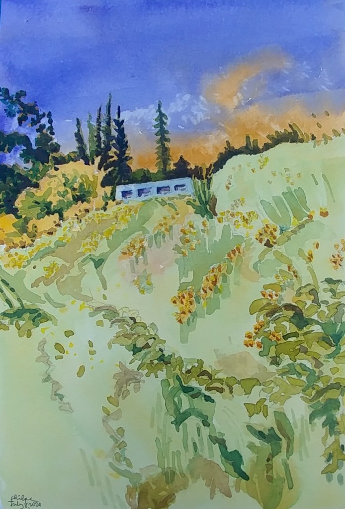
Longing for Summer
While enjoying the summer season it is hard to imagine winter. But in the northern regions, when the winter seems endless, we feel such a longing for summer. I experienced that longing on one such late winter morning. The sun was shining, but it was still so cold!
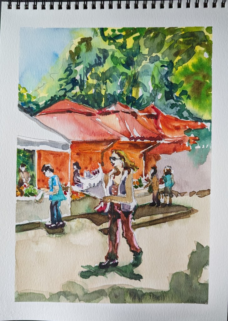
Artist and model
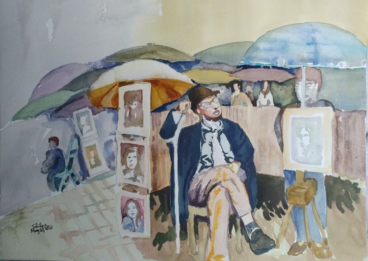
I had it all figured out. I was going to paint the artist I saw at Montmartre market in Paris. Many years passed. Now I was ready to paint and realized that the character I thought was an artist was really a customer who wanted get his portrait painted! Unfortunately this only proved a point that artists mostly live a life behind the limelight.
Ruins at the mountaintop
In wilderness. On a mountaintop with a view. Ruins nearby. Not a super sunny day. I tried to capture EVERYTHING! I love the movement I achieved. Now wondering if simplifying should be tried for this subject. What do you think?
Two color study
Just two color study I had been meaning to paint. Haze in the afternoon is made striking with watercolors. I love this medium!
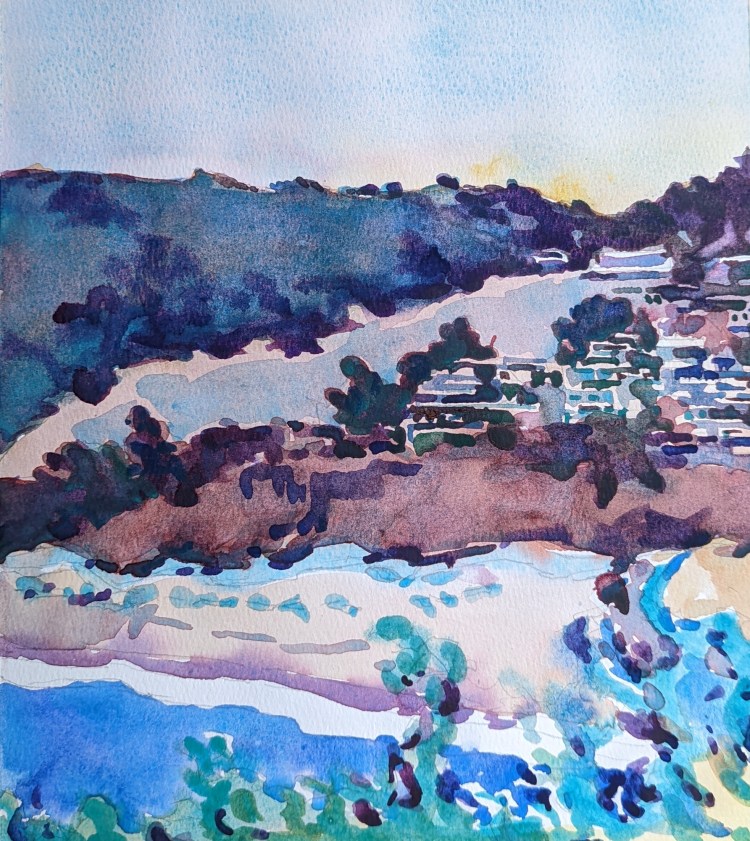
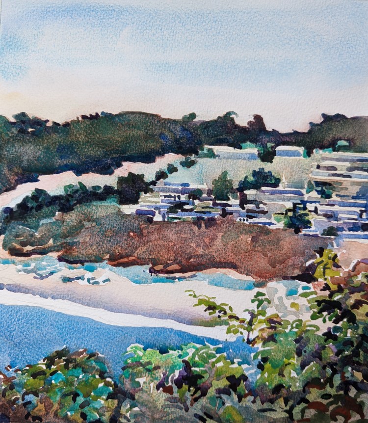
Largest Expanse in the front
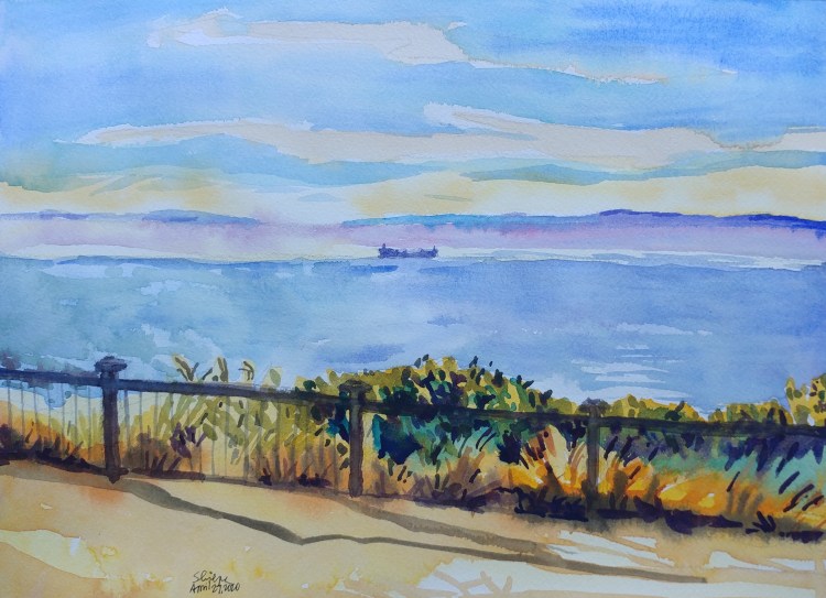
At Strait of Juan De Fuca, the horizon just keeps expanding. Largest of the vessels look tiny. If you want to paint this type of vista, subtle color variations are needed for sure!
Fumes and colors
Geiser floor has amazing colors if an artist wants to paint that subject. However; how to manage painting of fumes? That was a puzzle I had to solve. I came up with a solution of underpainting with Lemon yellow. But I am sure there is a better way that I can learn.
Never used pigments
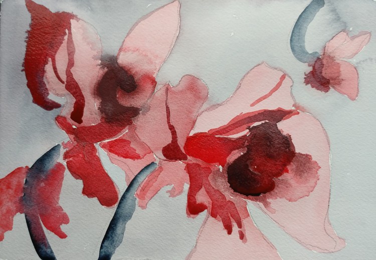
The orchids were just a reference photo. They were mostly peach in color with bright green stems. What was challenging was to use three colors that were never been tried before by me. I used M. Graham Naphthol Red, Daniel Smith Payne’s Blue Gray, and Sennelier Caput Mortum. Totally random and never tried at all. These tubes were just sitting in my box. Very loose and quick application and they became surprise orchids!
Dusk in Delft
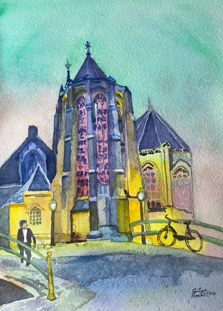
I painted this scene from the Netherlands only for the green sky that my camera captured. The pink of stained glass made a great color scheme against the sky. The scene itself was already a complete one.
Non-dominant hand floral

When a challenge involves what we think won’t work for us we may be surprised by our own performance! This challenge was to paint a floral with non dominant hand. What I didn’t realize was that the brain is giving the same instructions to both hands! My knowledge of watercolors still shows in this one I think.
Tranquil Grazing
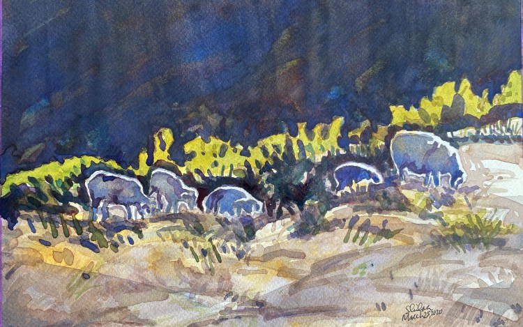
A place that’s calming either outdoors or indoors. What else could it be but an expansive or remote pasture? After all, herding was a profession of many spiritually advanced beings who have walked on this earth including Krishna and Jesus. This tranquility is very attractive. The least I can do is try to paint such a moment.
Abstract + Self Portrait

Facebook challenge topic by NWWS for the Day 4 of 14 was ‘Abstract Self Portrait. I was so excited to take this on! But I soon realized it was the most difficult challenge so far. I had never dabbled into a creating a large abstract piece. On top of that, a self portrait! It took me a while to come remotely close to abstract. And I thought I looked like a child in it 🙂
Grace outside my window.
I tend to focus on details, and I am trying to get away from that. Just aiming to show more of an impression. However; when the painting must show buildings, I have to focus on where the windows and shadows are. This can be a hinderance to a fast and free style though. Here is what I have for such a subject.
Focusing away from crisis
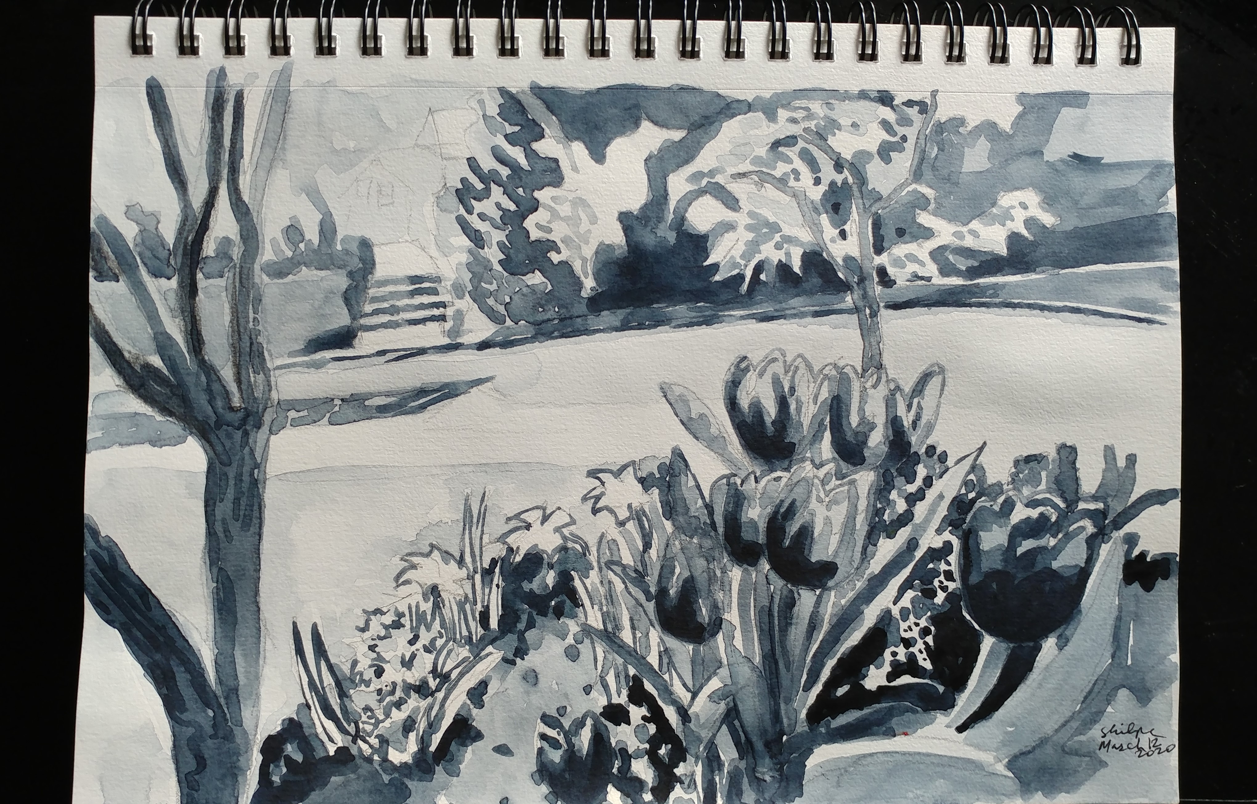
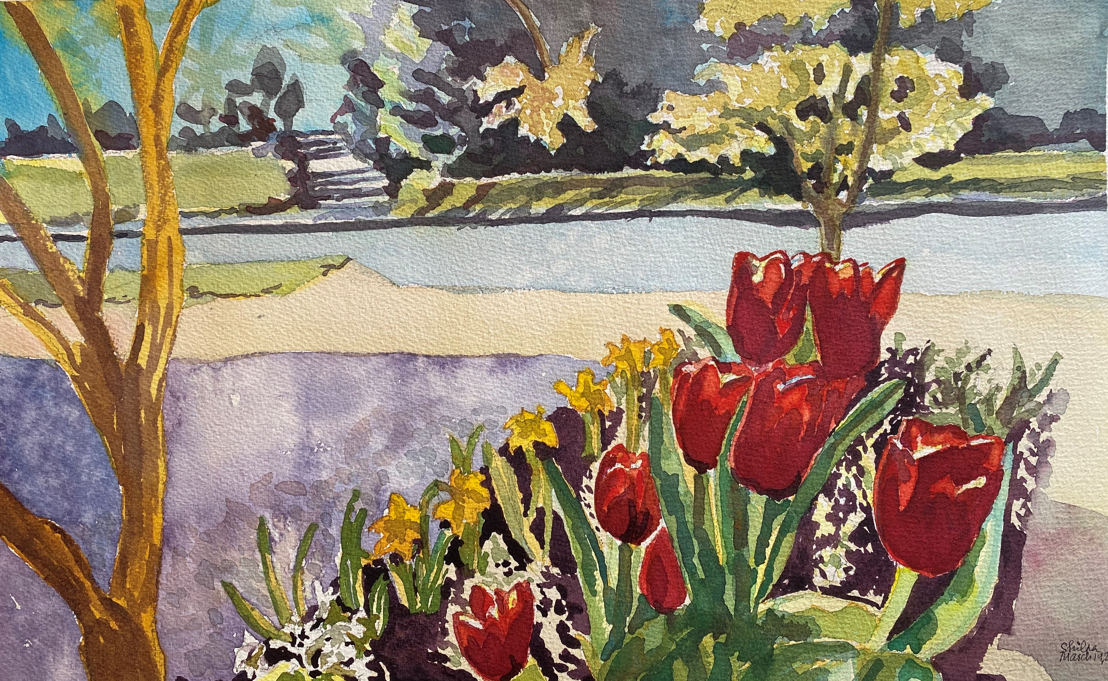
I have chosen to focus away from the current crisis during productive hours. So here is my new work.
When I think of painting flowers in watercolors, I can never look at them as single subject. It is more in a landscape form that I think of them. Tulips in the midst of their surrounding. How they contribute to the moment I experienced.
When I paint, doing a value sketch is always a must of course! I thought even a black and white has a merit. So sharing both!
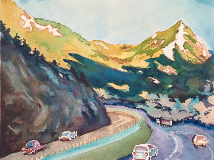
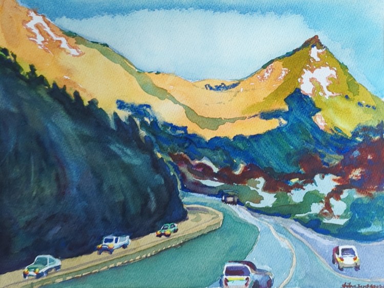
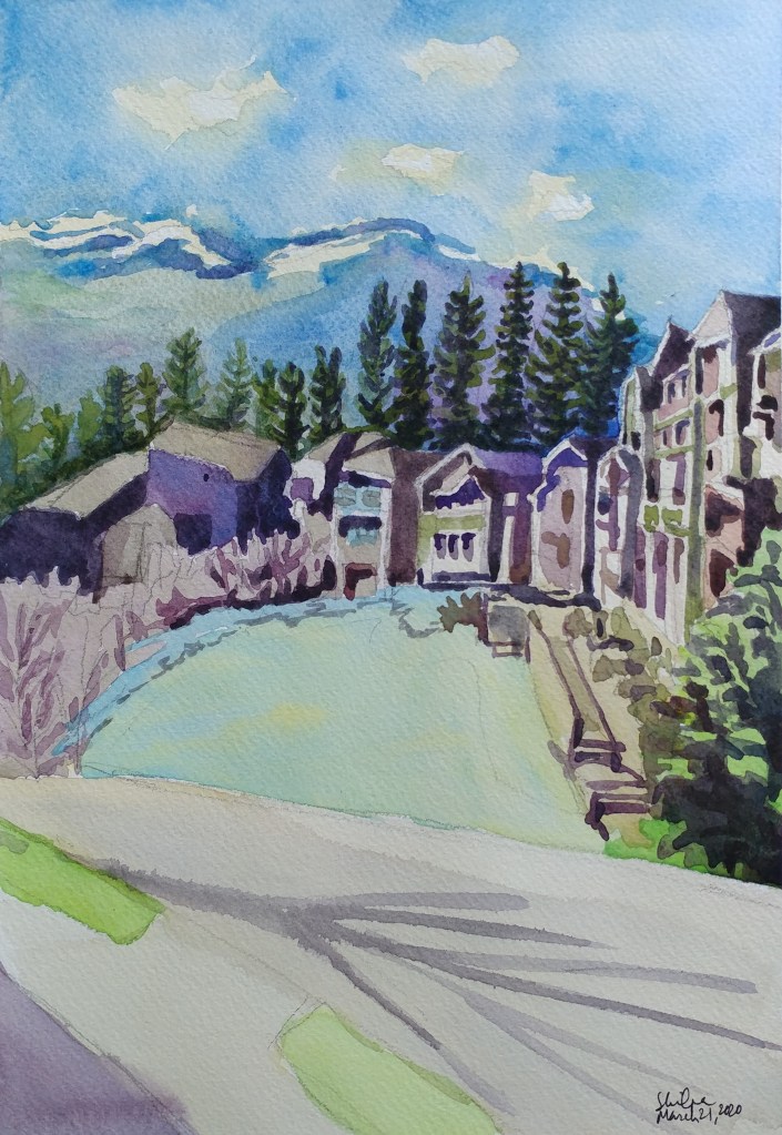
Destination in sight
Another quick study. When you are on the road, and the destination is finally in sight, the feeling you get. That was what I wanted to capture in this scene. A glimpse from the window en-route.
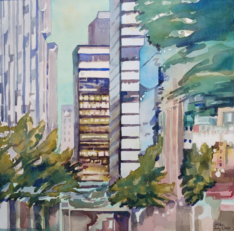
Night Lights Appeal
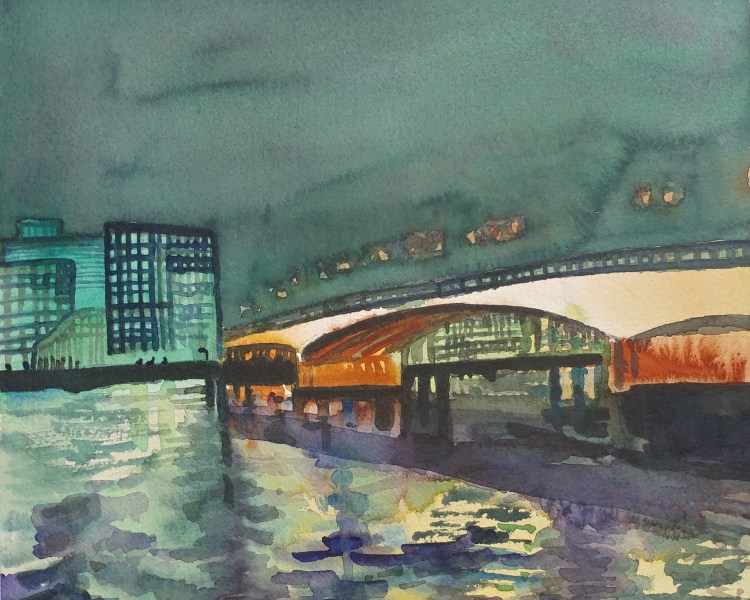
Urban lights at night are always attractive to me. They bring out a certain mood. I love painting these type of scenes. This was done with less precision than I would like, with more last minute decisions. But the effect still came out as expected.
Historic Figure
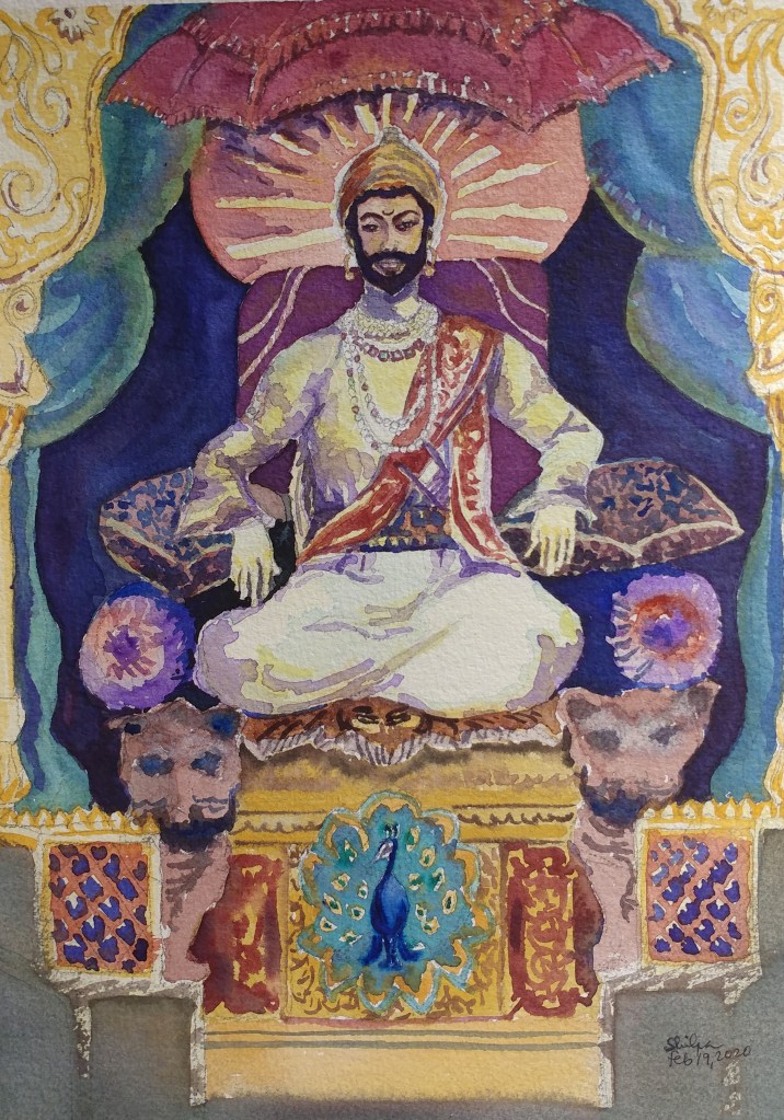
Imagining how a Rajah would look sitting on a throne was a challenge when I painted this figurative of Shivaji Rajah who was a 17th century Maratha ruler in India. I had only a few web references to go by. Having an adoration towards this Rajah helped.
Natural and Artificial Light

I have been wanting to paint a scene of a dawn I had captured on my camera 6 years ago. I finally had a courage to paint a scene that depicts both; the natural and an artificial light. I had to think of everything in detail for this one. I planned what values will go where and how warm or cool the colors need to be. Overall, I like it somewhat.
Large Foreground
Yesterday I decided to paint this vista which shows a large foreground area. I decided to keep a focus on the horizon and that worked. Our eyes move to the water ultimately even though there are reds and even though the sky and water are both blue.

Complement Study
I just realized today while painting that the shadows can be painted warm and cooler too. I had always thought they were painted with cooler colors. But noticing this nuance when I changed the top layer with warm brown around the focus area in this study and I was pleased!